This is “Case Study: Wicked Uncle”, section 13.6 from the book Online Marketing Essentials (v. 1.0). For details on it (including licensing), click here.
For more information on the source of this book, or why it is available for free, please see the project's home page. You can browse or download additional books there. To download a .zip file containing this book to use offline, simply click here.


13.6 Case Study: Wicked Uncle
Wicked Uncle (http://www.wickeduncle.com) had just launched its new Web site (and business), when they realized that its Web site was not easy to use. The premise of its service is easy and quick buying of children’s presents, and the layout of its Web site was a hindrance. Even though it had just launched, a Web site redevelopment was in order.
Figure 13.8 Home Page of the Wicked Uncle Web Site
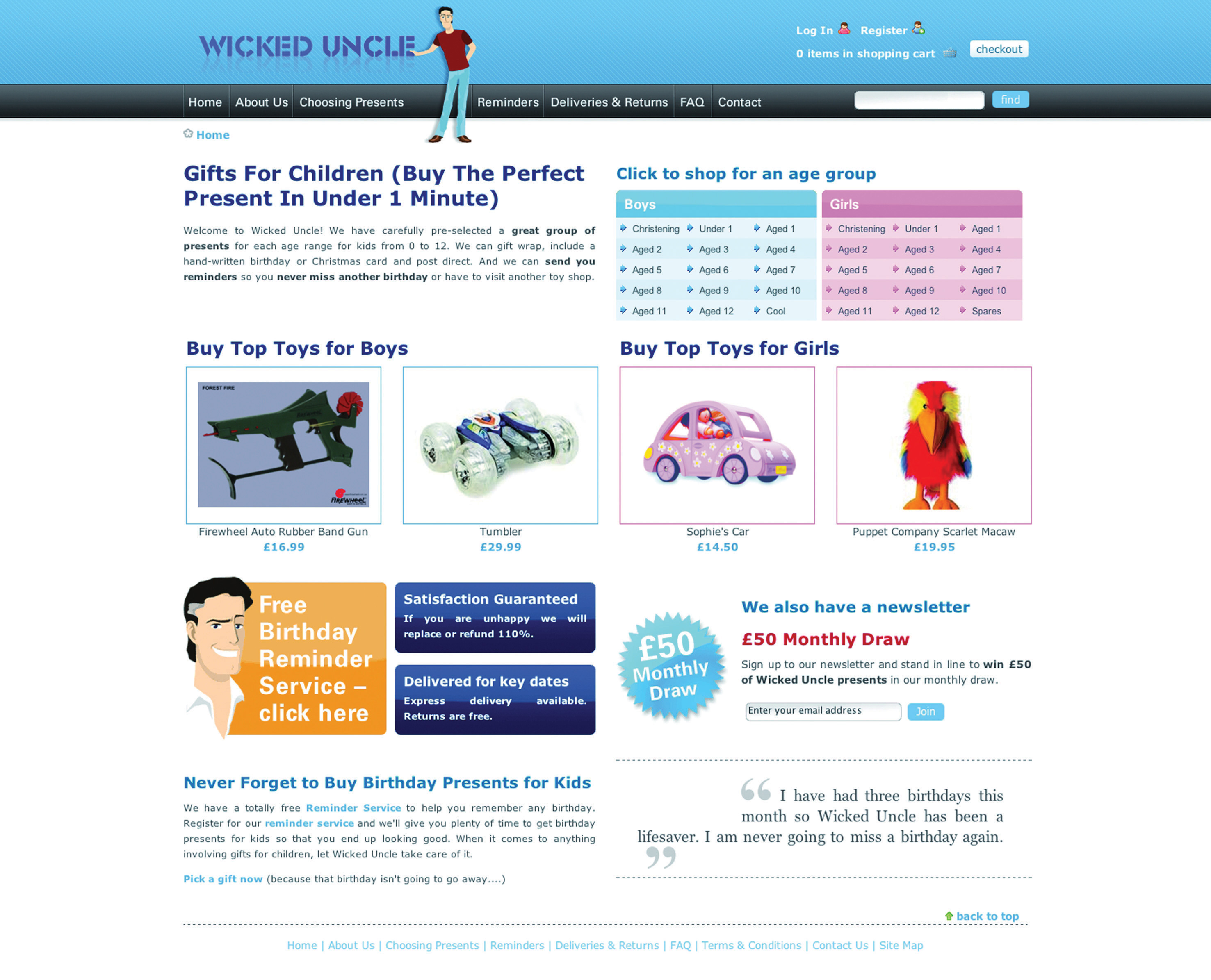
Source: Used by permission from Wicked Uncle.
The aim of the redevelopment was to make a gift buyable in under a minute. The new Web site would also allow Wicked Uncle to build up a database of users so that it could start one-to-one marketing to a database of subscribers. The look and feel of the first Web site was maintained, but the Web site was restructured to be more usable and to make the content more available to search engines.
Figure 13.9
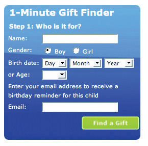
Find a gift in under one minute.
Source: Used by permission from Wicked Uncle.
The site was previously built to be 800 × 600 pixels, which is a resolution used by only 7 percent of the target market. The new Web site was built in 1024 × 768 pixels, which not only allowed more room but also is much better suited to the target market. More than 92 percent of the target UK market has high-resolution monitors.
Figure 13.10
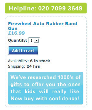
The help line is prominently displayed on each page.
Source: Used by permission from Wicked Uncle.
On the product pages, all product images were increased in size, and more images were included so that Web users could see the product from a variety of angles. Gifts for boys and gifts for girls were color coded to ensure easy navigation. The help line was prominently displayed on each page, as was an easy add-to-cart button. Pertinent information showing whether the item was in stock and how long it would take to ship was also easily available.
A birthday-reminder tool was implemented on the Web site. When users register with Wicked Uncle and register a child’s age, they get yearly birthday reminders of the child’s birthday. This has been very successful and has built up a database of e-mail addresses—from zero to fifteen thousand in less than a year!
The shopping process is exceptionally smooth, with functionality being carefully thought out. Within the process, the user is able to register different children with their own delivery address. The colors used in the shopping cart complement the Web site but are unique to the cart, so the cart stands out. There is always a clear indication of what the next step in the check-out process is.
Lastly, for those shoppers in a hurry, the Web site features a 1-Minute Gift Finder. With a new Web site that is easy to use, Wicked Uncle was able to run campaigns to drive targeted traffic to the Web site.
Case Study Questions
- Selling gifts online can be difficult if the shopper cannot see the actual product he or she is buying. What are some ways that the Web site design aims to overcome this?
- How does the navigation of Wicked Uncle meet users’ needs?
- How is the Web site able to be used for a number of eMarketing activities?