This is “A Complete Example”, section 10.8 from the book Beginning Statistics (v. 1.0). For details on it (including licensing), click here.
For more information on the source of this book, or why it is available for free, please see the project's home page. You can browse or download additional books there. To download a .zip file containing this book to use offline, simply click here.


10.8 A Complete Example
Learning Objective
- To see a complete linear correlation and regression analysis, in a practical setting, as a cohesive whole.
In the preceding sections numerous concepts were introduced and illustrated, but the analysis was broken into disjoint pieces by sections. In this section we will go through a complete example of the use of correlation and regression analysis of data from start to finish, touching on all the topics of this chapter in sequence.
In general educators are convinced that, all other factors being equal, class attendance has a significant bearing on course performance. To investigate the relationship between attendance and performance, an education researcher selects for study a multiple section introductory statistics course at a large university. Instructors in the course agree to keep an accurate record of attendance throughout one semester. At the end of the semester 26 students are selected a random. For each student in the sample two measurements are taken: x, the number of days the student was absent, and y, the student’s score on the common final exam in the course. The data are summarized in Table 10.4 "Absence and Score Data".
Table 10.4 Absence and Score Data
| Absences | Score | Absences | Score |
|---|---|---|---|
| x | y | x | y |
| 2 | 76 | 4 | 41 |
| 7 | 29 | 5 | 63 |
| 2 | 96 | 4 | 88 |
| 7 | 63 | 0 | 98 |
| 2 | 79 | 1 | 99 |
| 7 | 71 | 0 | 89 |
| 0 | 88 | 1 | 96 |
| 0 | 92 | 3 | 90 |
| 6 | 55 | 1 | 90 |
| 6 | 70 | 3 | 68 |
| 2 | 80 | 1 | 84 |
| 2 | 75 | 3 | 80 |
| 1 | 63 | 1 | 78 |
A scatter plot of the data is given in Figure 10.13 "Plot of the Absence and Exam Score Pairs". There is a downward trend in the plot which indicates that on average students with more absences tend to do worse on the final examination.
Figure 10.13 Plot of the Absence and Exam Score Pairs
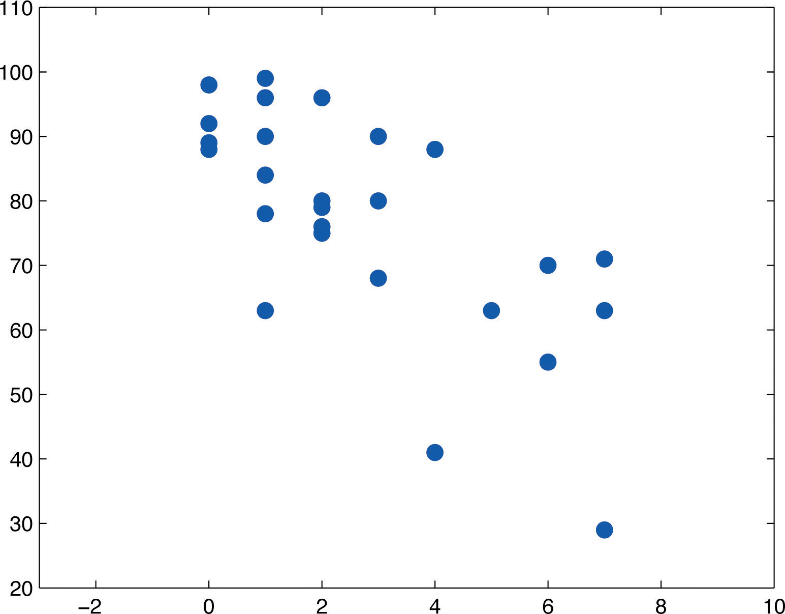
The trend observed in Figure 10.13 "Plot of the Absence and Exam Score Pairs" as well as the fairly constant width of the apparent band of points in the plot makes it reasonable to assume a relationship between x and y of the form
where and are unknown parameters and ε is a normal random variable with mean zero and unknown standard deviation σ. Note carefully that this model is being proposed for the population of all students taking this course, not just those taking it this semester, and certainly not just those in the sample. The numbers , , and σ are parameters relating to this large population.
First we perform preliminary computations that will be needed later. The data are processed in Table 10.5 "Processed Absence and Score Data".
Table 10.5 Processed Absence and Score Data
| x | y | x2 | xy | y2 | x | y | x2 | xy | y2 |
|---|---|---|---|---|---|---|---|---|---|
| 2 | 76 | 4 | 152 | 5776 | 4 | 41 | 16 | 164 | 1681 |
| 7 | 29 | 49 | 203 | 841 | 5 | 63 | 25 | 315 | 3969 |
| 2 | 96 | 4 | 192 | 9216 | 4 | 88 | 16 | 352 | 7744 |
| 7 | 63 | 49 | 441 | 3969 | 0 | 98 | 0 | 0 | 9604 |
| 2 | 79 | 4 | 158 | 6241 | 1 | 99 | 1 | 99 | 9801 |
| 7 | 71 | 49 | 497 | 5041 | 0 | 89 | 0 | 0 | 7921 |
| 0 | 88 | 0 | 0 | 7744 | 1 | 96 | 1 | 96 | 9216 |
| 0 | 92 | 0 | 0 | 8464 | 3 | 90 | 9 | 270 | 8100 |
| 6 | 55 | 36 | 330 | 3025 | 1 | 90 | 1 | 90 | 8100 |
| 6 | 70 | 36 | 420 | 4900 | 3 | 68 | 9 | 204 | 4624 |
| 2 | 80 | 4 | 160 | 6400 | 1 | 84 | 1 | 84 | 7056 |
| 2 | 75 | 4 | 150 | 5625 | 3 | 80 | 9 | 240 | 6400 |
| 1 | 63 | 1 | 63 | 3969 | 1 | 78 | 1 | 78 | 6084 |
Adding up the numbers in each column in Table 10.5 "Processed Absence and Score Data" gives
Then
and
We begin the actual modelling by finding the least squares regression line, the line that best fits the data. Its slope and y-intercept are
Rounding these numbers to two decimal places, the least squares regression line for these data is
The goodness of fit of this line to the scatter plot, the sum of its squared errors, is
This number is not particularly informative in itself, but we use it to compute the important statistic
The statistic estimates the standard deviation σ of the normal random variable ε in the model. Its meaning is that among all students with the same number of absences, the standard deviation of their scores on the final exam is about 12.1 points. Such a large value on a 100-point exam means that the final exam scores of each sub-population of students, based on the number of absences, are highly variable.
The size and sign of the slope indicate that, for every class missed, students tend to score about 5.23 fewer points lower on the final exam on average. Similarly for every two classes missed students tend to score on average fewer points on the final exam, or about a letter grade worse on average.
Since 0 is in the range of x-values in the data set, the y-intercept also has meaning in this problem. It is an estimate of the average grade on the final exam of all students who have perfect attendance. The predicted average of such students is
Before we use the regression equation further, or perform other analyses, it would be a good idea to examine the utility of the linear regression model. We can do this in two ways: 1) by computing the correlation coefficient r to see how strongly the number of absences x and the score y on the final exam are correlated, and 2) by testing the null hypothesis (the slope of the population regression line is zero, so x is not a good predictor of y) against the natural alternative (the slope of the population regression line is negative, so final exam scores y go down as absences x go up).
The correlation coefficient r is
a moderate negative correlation.
Turning to the test of hypotheses, let us test at the commonly used 5% level of significance. The test is
From Figure 12.3 "Critical Values of ", with degrees of freedom , so the rejection region is The value of the standardized test statistic is
which falls in the rejection region. We reject H0 in favor of Ha. The data provide sufficient evidence, at the 5% level of significance, to conclude that is negative, meaning that as the number of absences increases average score on the final exam decreases.
As already noted, the value gives a point estimate of how much one additional absence is reflected in the average score on the final exam. For each additional absence the average drops by about 5.23 points. We can widen this point estimate to a confidence interval for At the 95% confidence level, from Figure 12.3 "Critical Values of " with degrees of freedom, The 95% confidence interval for based on our sample data is
or We are 95% confident that, among all students who ever take this course, for each additional class missed the average score on the final exam goes down by between 3.08 and 7.38 points.
If we restrict attention to the sub-population of all students who have exactly five absences, say, then using the least squares regression equation we estimate that the average score on the final exam for those students is
This is also our best guess as to the score on the final exam of any particular student who is absent five times. A 95% confidence interval for the average score on the final exam for all students with five absences is
which is the interval This confidence interval suggests that the true mean score on the final exam for all students who are absent from class exactly five times during the semester is likely to be between 58.17 and 72.01.
If a particular student misses exactly five classes during the semester, his score on the final exam is predicted with 95% confidence to be in the interval
which is the interval This prediction interval suggests that this individual student’s final exam score is likely to be between 39.13 and 91.05. Whereas the 95% confidence interval for the average score of all student with five absences gave real information, this interval is so wide that it says practically nothing about what the individual student’s final exam score might be. This is an example of the dramatic effect that the presence of the extra summand 1 under the square sign in the prediction interval can have.
Finally, the proportion of the variability in the scores of students on the final exam that is explained by the linear relationship between that score and the number of absences is estimated by the coefficient of determination, r2. Since we have already computed r above we easily find that
or about 49%. Thus although there is a significant correlation between attendance and performance on the final exam, and we can estimate with fair accuracy the average score of students who miss a certain number of classes, nevertheless less than half the total variation of the exam scores in the sample is explained by the number of absences. This should not come as a surprise, since there are many factors besides attendance that bear on student performance on exams.
Key Takeaway
- It is a good idea to attend class.
Exercises
-
The data give the amount x of silicofluoride in the water (mg/L) and the amount y of lead in the bloodstream (μg/dL) of ten children in various communities with and without municipal water. Perform a complete analysis of the data, in analogy with the discussion in this section (that is, make a scatter plot, do preliminary computations, find the least squares regression line, find , , and r, and so on). In the hypothesis test use as the alternative hypothesis , and test at the 5% level of significance. Use confidence level 95% for the confidence interval for Construct 95% confidence and predictions intervals at at the end.
-
The table gives the weight x (thousands of pounds) and available heat energy y (million BTU) of a standard cord of various species of wood typically used for heating. Perform a complete analysis of the data, in analogy with the discussion in this section (that is, make a scatter plot, do preliminary computations, find the least squares regression line, find , , and r, and so on). In the hypothesis test use as the alternative hypothesis , and test at the 5% level of significance. Use confidence level 95% for the confidence interval for Construct 95% confidence and predictions intervals at at the end.
The exercises in this section are unrelated to those in previous sections.
-
Large Data Sets 3 and 3A list the shoe sizes and heights of 174 customers entering a shoe store. The gender of the customer is not indicated in Large Data Set 3. However, men’s and women’s shoes are not measured on the same scale; for example, a size 8 shoe for men is not the same size as a size 8 shoe for women. Thus it would not be meaningful to apply regression analysis to Large Data Set 3. Nevertheless, compute the scatter diagrams, with shoe size as the independent variable (x) and height as the dependent variable (y), for (i) just the data on men, (ii) just the data on women, and (iii) the full mixed data set with both men and women. Does the third, invalid scatter diagram look markedly different from the other two?
http://www.flatworldknowledge.com/sites/all/files/data3.xls
http://www.flatworldknowledge.com/sites/all/files/data3A.xls
-
Separate out from Large Data Set 3A just the data on men and do a complete analysis, with shoe size as the independent variable (x) and height as the dependent variable (y). Use and whenever appropriate.
http://www.flatworldknowledge.com/sites/all/files/data3A.xls
-
Separate out from Large Data Set 3A just the data on women and do a complete analysis, with shoe size as the independent variable (x) and height as the dependent variable (y). Use and whenever appropriate.
http://www.flatworldknowledge.com/sites/all/files/data3A.xls
Large Data Set Exercises
Answers
-
, , , ,
, ,
,
,
r = 0.9174, r2 = 0.8416.
, T = 6.518.
The 95% confidence interval for is:
At , the 95% confidence interval for is
At , the 95% prediction interval for y is
-
-
The positively correlated trend seems less profound than that in each of the previous plots.
-
-
The regression line: Coefficient of Correlation: r = 0.9431. Coefficient of Determination: r2 = 0.8894. A 95% confidence interval for : Test Statistic for : T = 24.7209. At , ; a 95% confidence interval for the mean value of y is: ; and a 95% prediction interval for an individual value of y is: