This is “Formatting Charts”, section 4.2 from the book Using Microsoft Excel (v. 1.0). For details on it (including licensing), click here.
For more information on the source of this book, or why it is available for free, please see the project's home page. You can browse or download additional books there. To download a .zip file containing this book to use offline, simply click here.


4.2 Formatting Charts
Learning Objectives
- Apply formatting commands to the X and Y axes.
- Enhance the visual appearance of the chart title and chart legend by using various formatting techniques.
- Assign titles to the X and Y axes that clarify labels and numeric values for the reader.
- Apply labels and formatting techniques to the data series in the plot area of a chart.
- Apply formatting commands to the chart area and the plot area of a chart.
- Employ series lines and annotations to enhance trends and provide additional information on a chart.
You can use a variety of formatting techniques to enhance the appearance of a chart once you have created it. Formatting commands are applied to a chart for the same reason they are applied to a worksheet: they make the chart easier to read. However, formatting techniques also help you qualify and explain the data in a chart. For example, you can add footnotes explaining the data source as well as notes that clarify the type of numbers being presented (i.e., if the numbers in a chart are truncated, you can state whether they are in thousands, millions, etc.). These notes are also helpful in answering questions if you are using charts in a live presentation. We will demonstrate these formatting techniques using the column chart and stacked column chart from the previous section.
X and Y Axis Formats
Follow-along file: Continue with Excel Objective 4.00. (Use file Excel Objective 4.08 if starting here.)
There are numerous formatting commands we can apply to the X and Y axes of the chart. Although adjusting the font size, style, and color are common, many more options are available through the Format Axis dialog box (see Figure 4.5 "Format Axis Dialog Box"). The following steps demonstrate a few of these formatting techniques on the Grade Distribution Comparison chart:
- Click anywhere along the X axis (horizontal axis) of the Grade Distribution Comparison chart on the Grade Distribution worksheet.
- Click the Home tab of the Ribbon.
- Change the font style to Arial. Notice that as the mouse pointer hovers over a font style, you can preview the change on the chart before you make a selection.
- Change the font size to 11 points and bold the font. The final appearance of the X axis is shown in Figure 4.24 "Formatted X Axis".
- Click anywhere along the Y axis to activate it.
-
Repeat steps 3 and 4.
Figure 4.24 Formatted X Axis

- Click the Format tab in the Chart Tools section of the Ribbon.
- Click the Format Selection button in the Current Selection group of commands. This opens the Format Axis dialog box.
- Click Number from the list of options on the left side of the Format Axis dialog box (see Figure 4.25 "Formatting Numbers on the Y Axis"). The commands in this section of the Format Axis dialog box are used to format numbers that appear on the X and Y axes of a chart.
- Click in the Decimal places input box and change the value to 0 (see Figure 4.25 "Formatting Numbers on the Y Axis").
- Click the Close button at the bottom of the Format Axis dialog box. The formatting adjustments are shown in Figure 4.26 "Completed X and Y Axis Formats".
Figure 4.25 Formatting Numbers on the Y Axis
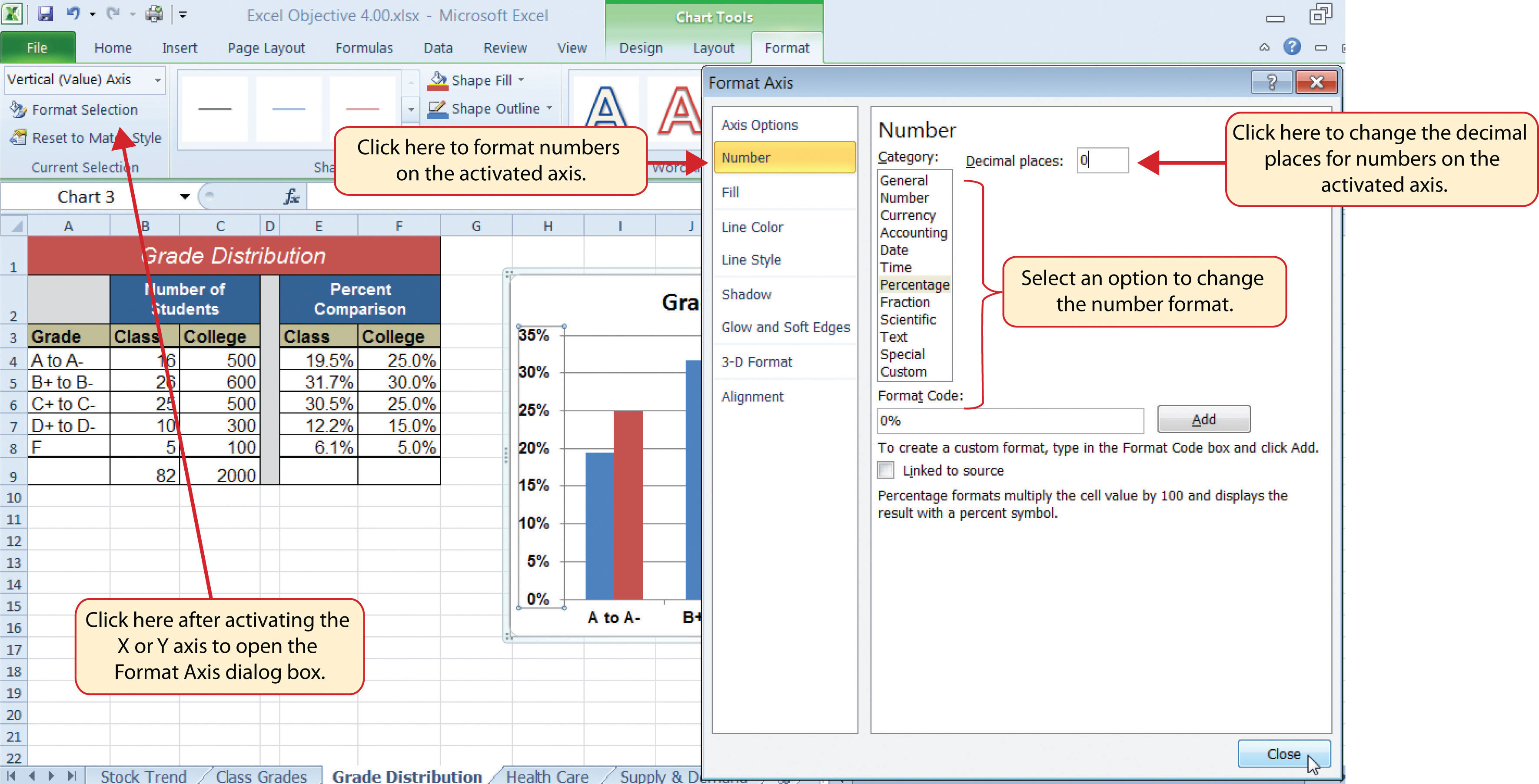
Figure 4.26 Completed X and Y Axis Formats

Skill Refresher: Formatting the X and Y Axes
- Click anywhere along the X or Y axis to activate it.
- Click either the Home tab or Design tab of the Ribbon.
- Select any of the available formatting commands in these tabs.
Skill Refresher: X and Y Axis Number Formats
- Click anywhere along the X or Y axis to activate it.
- Click the Layout tab in the Chart Tools section of the Ribbon.
- Click the Format Selection button in the Current Selection group of commands.
- Click Number from the list of options on the left side of the Format Axis dialog box.
- Select a number format and set decimal places on the right side of the Format Axis dialog box.
- Click the Close button at the bottom of the Format Axis dialog box.
Chart Legend and Title Formats
Follow-along file: Continue with Excel Objective 4.00. (Use file Excel Objective 4.09 if starting here.)
The next items we will format on the Grade Distribution Comparison chart are the chart legend and title. Similar to the how we formatted the X and Y axes, we can format these items by activating them and using the formatting commands in the Home tab or the Format tab of the Ribbon. The following steps explain how to add these formats:
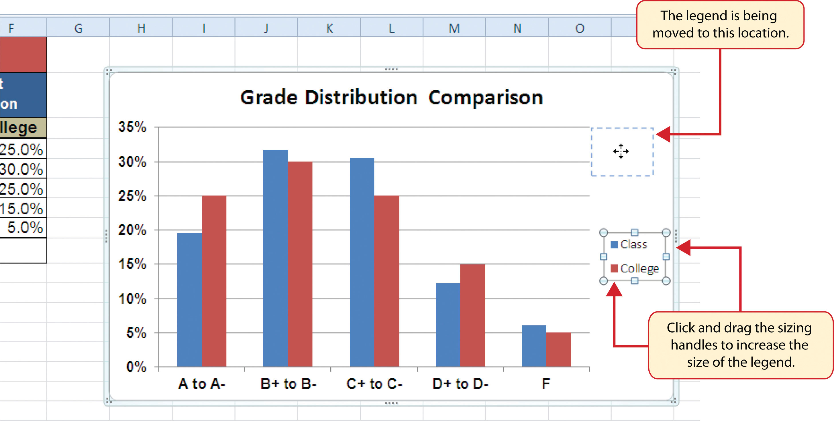
- Click the legend on the Grade Distribution Comparison chart in the Grade Distribution worksheet.
-
Click and drag the legend so the top of the legend aligns with the 35% line next to the plot area (see Figure 4.27 "Moving the Legend").
Figure 4.27 Moving the Legend
- Change the font style in the Home tab of the Ribbon to Arial.
- Change the font size to 12 points.
- Click the bold and italics commands in the Home tab of the Ribbon.
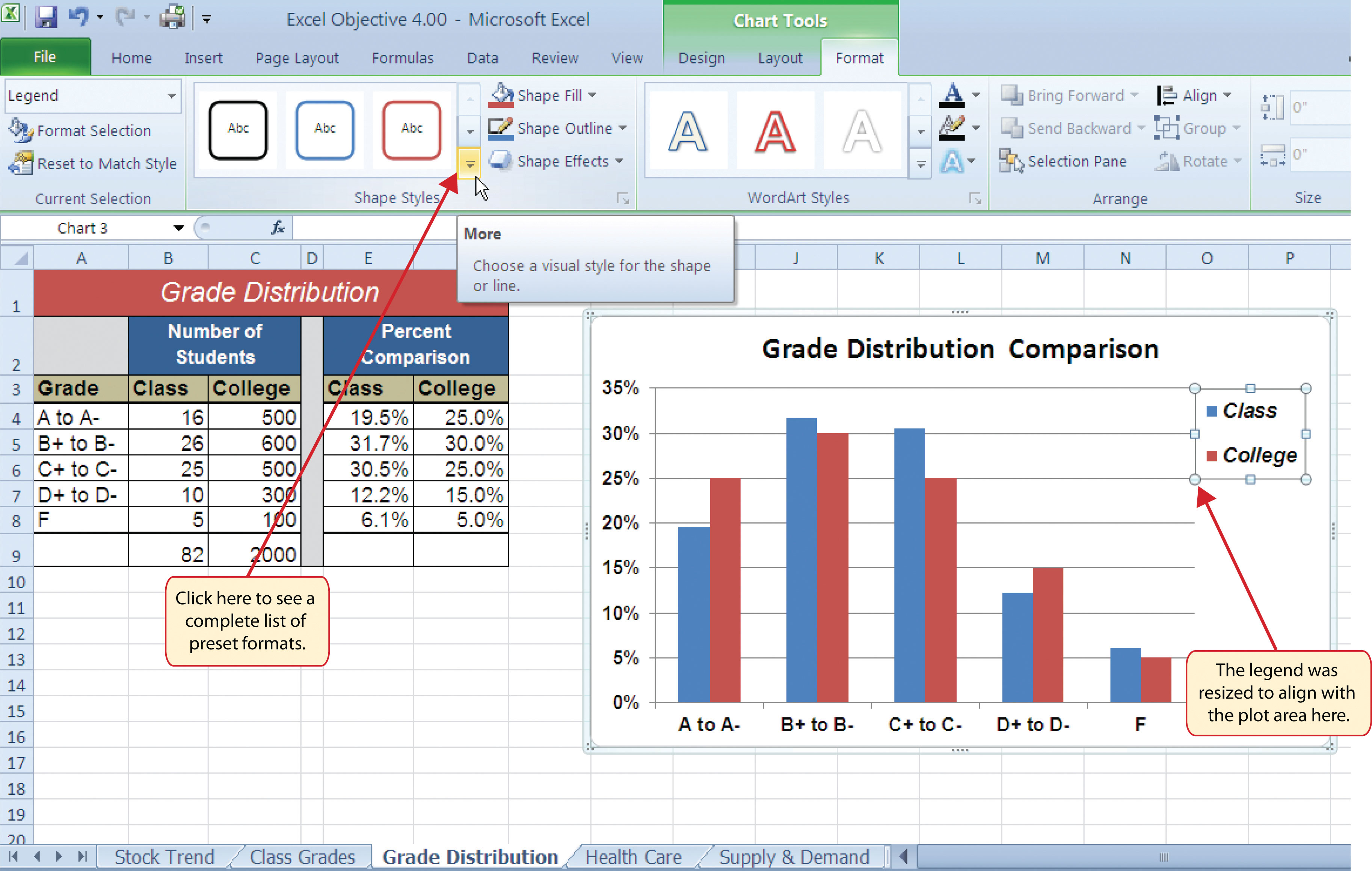
- Click and drag the left sizing handle so the legend is against the plot area (see Figure 4.28 "Legend Formatted and Resized").
-
Click and drag the lower center sizing handle so the bottom of the legend is aligned with the 25% line of the plot area (see Figure 4.28 "Legend Formatted and Resized").
Figure 4.28 Legend Formatted and Resized
- Click the chart title to activate it.
- Click the Format tab in the Chart Tools section of the Ribbon.
- Click the More down arrow in the Shape Styles group of commands to open the complete set of preset format styles (see Figure 4.28 "Legend Formatted and Resized").
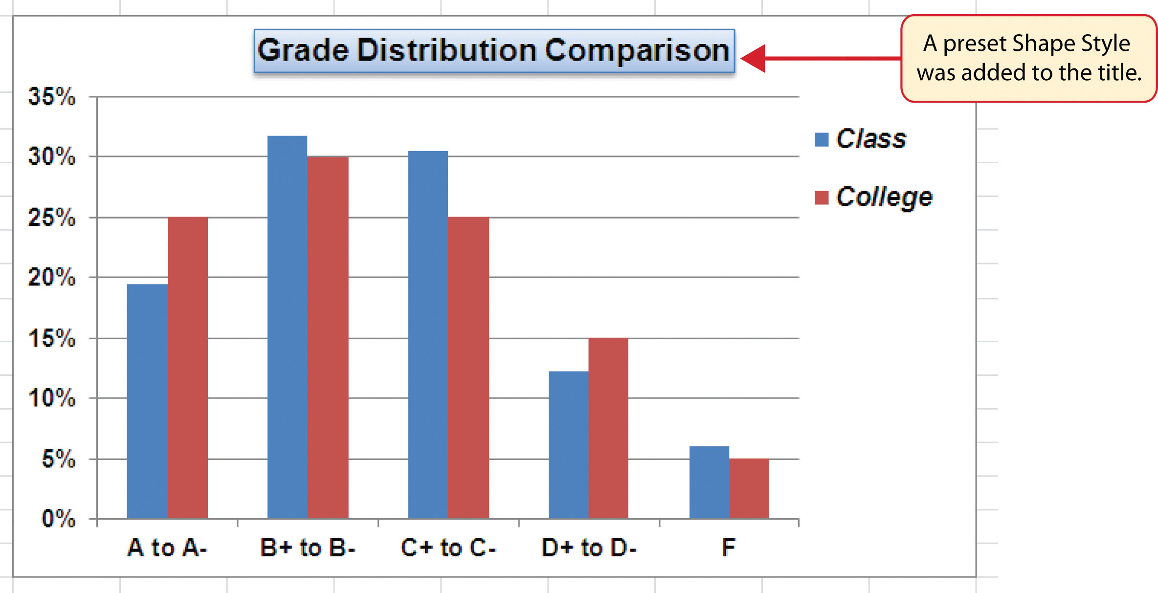
- Click the Subtle Effect - Blue, Accent 1 option, which is in the fourth row, second style from the left. As the mouse hovers over a style, you can preview the appearance on the chart.
- In the Home tab of the Ribbon, change the font style to Arial and reduce the font size to 14 points (see Figure 4.29 "Chart Legend and Title Formatted").
Figure 4.29 Chart Legend and Title Formatted
Skill Refresher: Formatting the Chart Legend
- Click the Legend to activate it.
- Click either the Home tab or the Format tab of the Ribbon.
- Select any of the available formatting commands in these tabs.
- Click and drag the legend to move it.
- Click and drag any of the sizing handles to adjust the size of the legend.
Skill Refresher: Formatting the Chart Title
- Click anywhere on the chart title.
- Click either the Home tab or the Format tab of the Ribbon.
- Select any of the available formatting commands in these tabs.
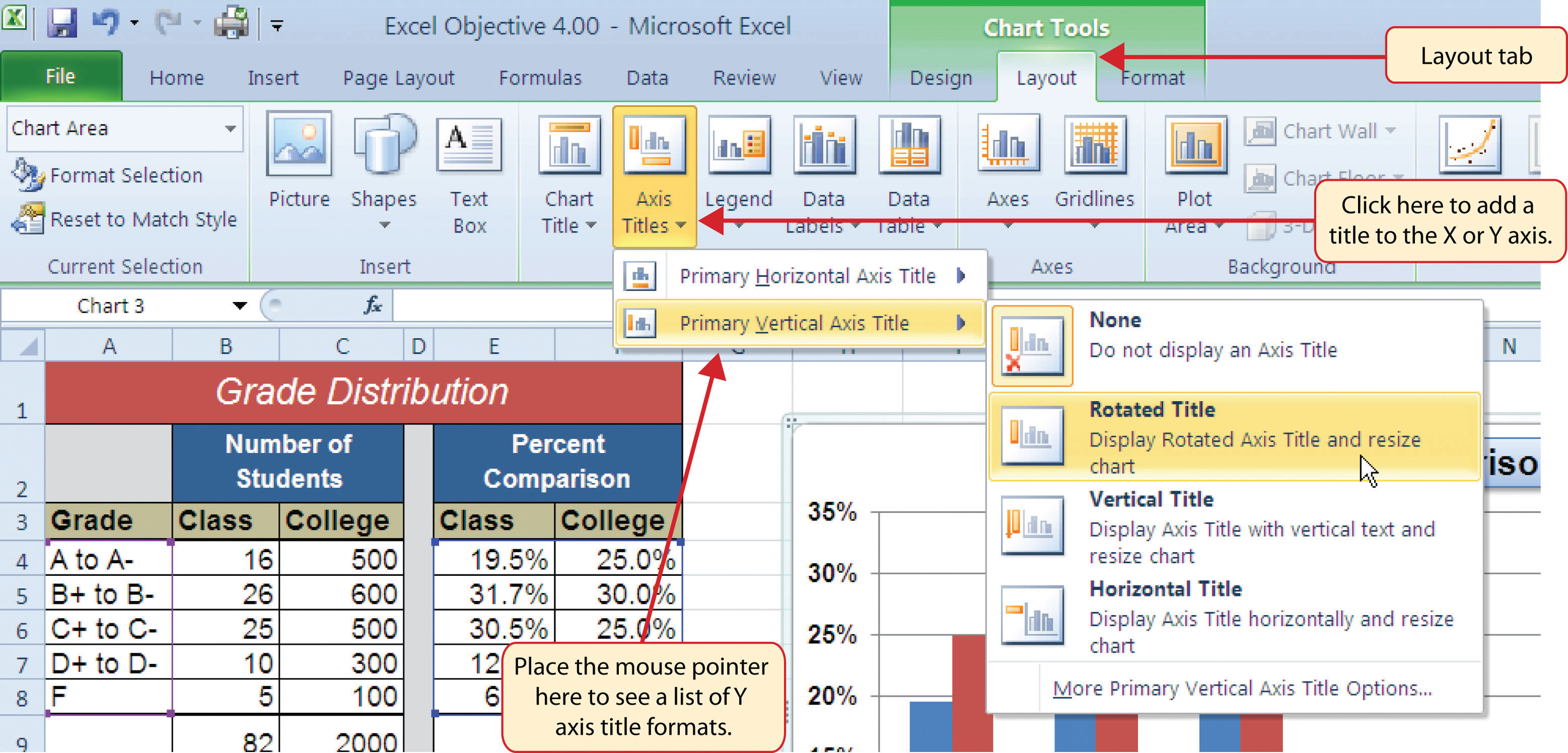
X and Y Axis Titles
Follow-along file: Continue with Excel Objective 4.00. (Use file Excel Objective 4.10 if starting here.)
Titles for the X and Y axes are necessary for defining the numbers and categories presented on a chart. For example, by looking at the Grade Distribution Comparison chart, it is not clear what the percentages along the Y axis represent. The following steps explain how to add titles to the X and Y axes to define these numbers and categories:
- Click anywhere on the Grade Distribution Comparison chart in the Grade Distribution worksheet to activate it.
- Click the Layout tab in the Chart Tools section of the Ribbon.
- Click the Axis Titles button in the Labels group of commands.
-
Place the mouse pointer over the Primary Vertical Axis TitleCommand used to add a title to the Y axis of a chart. option from the drop-down list. This opens a second drop-down list. Select the Rotated Title option from the second drop-down list. This adds a title next to the Y axis (see Figure 4.30 "Selecting a Title for the Y Axis").
Figure 4.30 Selecting a Title for the Y Axis
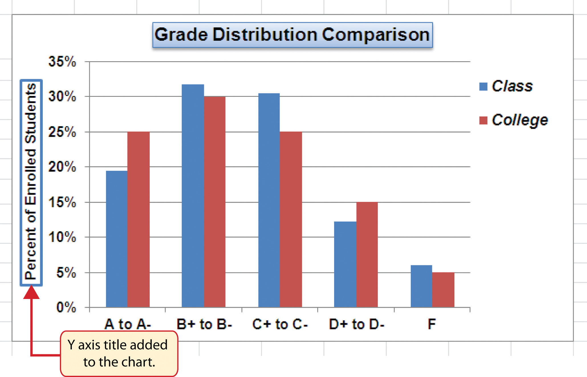
- Click the Format tab in the Chart Tools section of the Ribbon.
- Click the Colored Outline - Blue, Accent 1 preset style option in the Shape Styles group of commands.
- Change the font style in the Home tab to Arial. Change the font size to 11 points.
- Click in the beginning of the Y axis title and delete the generic title. Type Percent of Enrolled Students.
-
Click and drag the Y axis title so it is between 0% and 30% in the plot area (see Figure 4.31 "Adding and Formatting the Y Axis Title").
Figure 4.31 Adding and Formatting the Y Axis Title
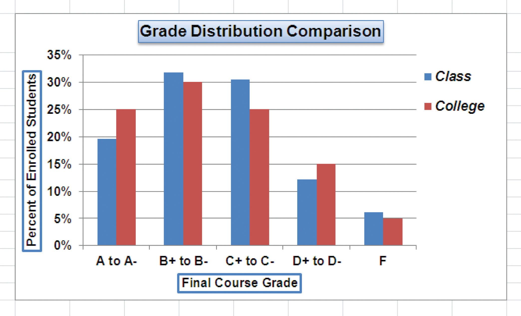
- Click the Layout tab in the Chart Tools section of the Ribbon.
- Click the Axis Titles button in the Labels group of commands.
- Place the mouse pointer over the Primary Horizontal Axis TitleCommand used to add a title to the X axis of a chart. option. Select Title Below Axis from the second drop-down list.
- Click the Format tab in the Chart Tools section of the Ribbon.
- Click the Colored Outline - Blue, Accent 1 preset style option in the Shape Styles group of commands.
- Change the font style in the Home tab to Arial. Change the font size to 11 points.
- Click in the beginning of the X axis title and delete the generic title. Type Final Course Grade.
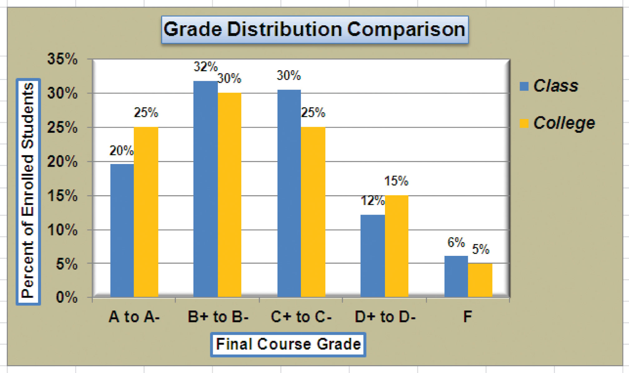
Figure 4.32 "X and Y Axis Titles Added" shows the added titles for the X and Y axes. The titles provide definitions for the grade categories along the X axis as well as the percentages on the Y axis.
Figure 4.32 X and Y Axis Titles Added
Skill Refresher: X and Y Axis Titles
- Click anywhere on the chart to activate it.
- Click the Layout tab in the Chart Tools section of the Ribbon.
- Click the Axis Titles button in the Labels group of commands.
- Place the mouse pointer over the Primary Horizontal Axis Title (X axis) or the Primary Vertical Axis Title (Y axis) option.
- Select one of the configuration formats from the second drop-down list.
- Click in the axis title to remove the generic title and type a new title.
Data Series Labels and Formats
Follow-along file: Continue with Excel Objective 4.00. (Use file Excel Objective 4.11 if starting here.)
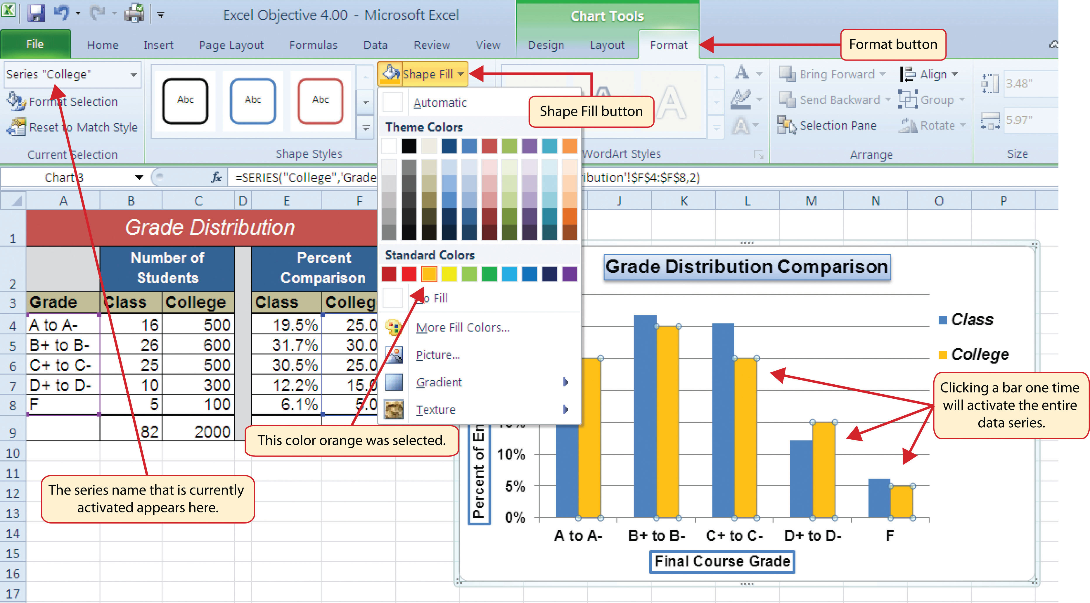
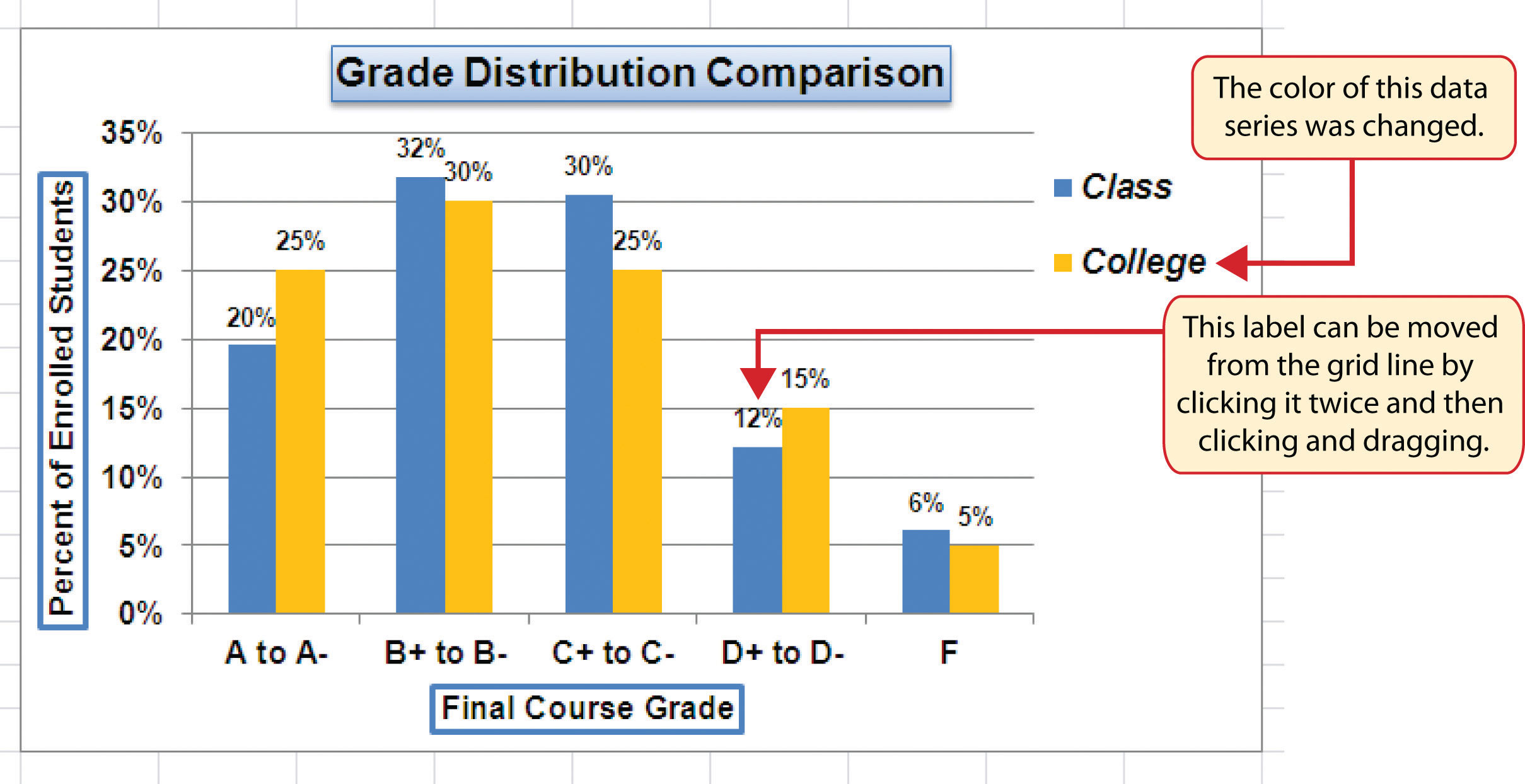
Adding labels to the data series of a chart is a key formatting feature. A data seriesA quantitative data set that is displayed graphically on a chart. Data sets are typically displayed in the form of columns or lines on a chart. is the item that is being displayed graphically on a chart. For example, the blue bars on the Grade Distribution Comparison chart represent one data series. We can add labels at the end of each bar to show the exact percentage the bar represents. In addition, we can add other formatting enhancements to the data series, such as changing the color of the bars or adding an effect. The following steps explain how to add these labels and formats to the chart:
- Click any red bar representing the College data series on the Grade Distribution Comparison chart in the Grade Distribution worksheet. Clicking one bar automatically activates all bars in the data series. If you click a bar a second time, only that bar is activated.
- Click the Format tab in the Chart Tools section of the Ribbon.
- Click the down arrow on the Shape Fill button in the Shape Styles group of commands.
-
Click the orange color square from the drop-down color palette (see Figure 4.33 "Changing the Color of a Data Series"). As you move the mouse pointer over other colors on the palette, you can preview the change on the data bars.
Figure 4.33 Changing the Color of a Data Series
- Click the Layout tab in the Chart Tools section of the Ribbon.
- Click the Data Labels button in the Labels group of commands. Select More Data Label Options at the bottom of the drop-down list to open the Format Data Labels dialog box.
- Click the Number option from the list on the left side of the Format Data Labels dialog box.
- Select Percentage on the right side of the Format Data Labels dialog box (see Figure 4.34 "Adding Labels to a Data Series").
- Click in the Decimal Places input box and change the number of decimal places to zero.
- Click the Close button at the bottom of the Format Data Labels dialog box.
- Click the Home tab of the Ribbon.
- Change the font style to Arial, change the font size to 9 points, and select the Bold command.
- Click any blue bar in the Class data series.
- Repeat steps 5 through 12.
Figure 4.34 Adding Labels to a Data Series
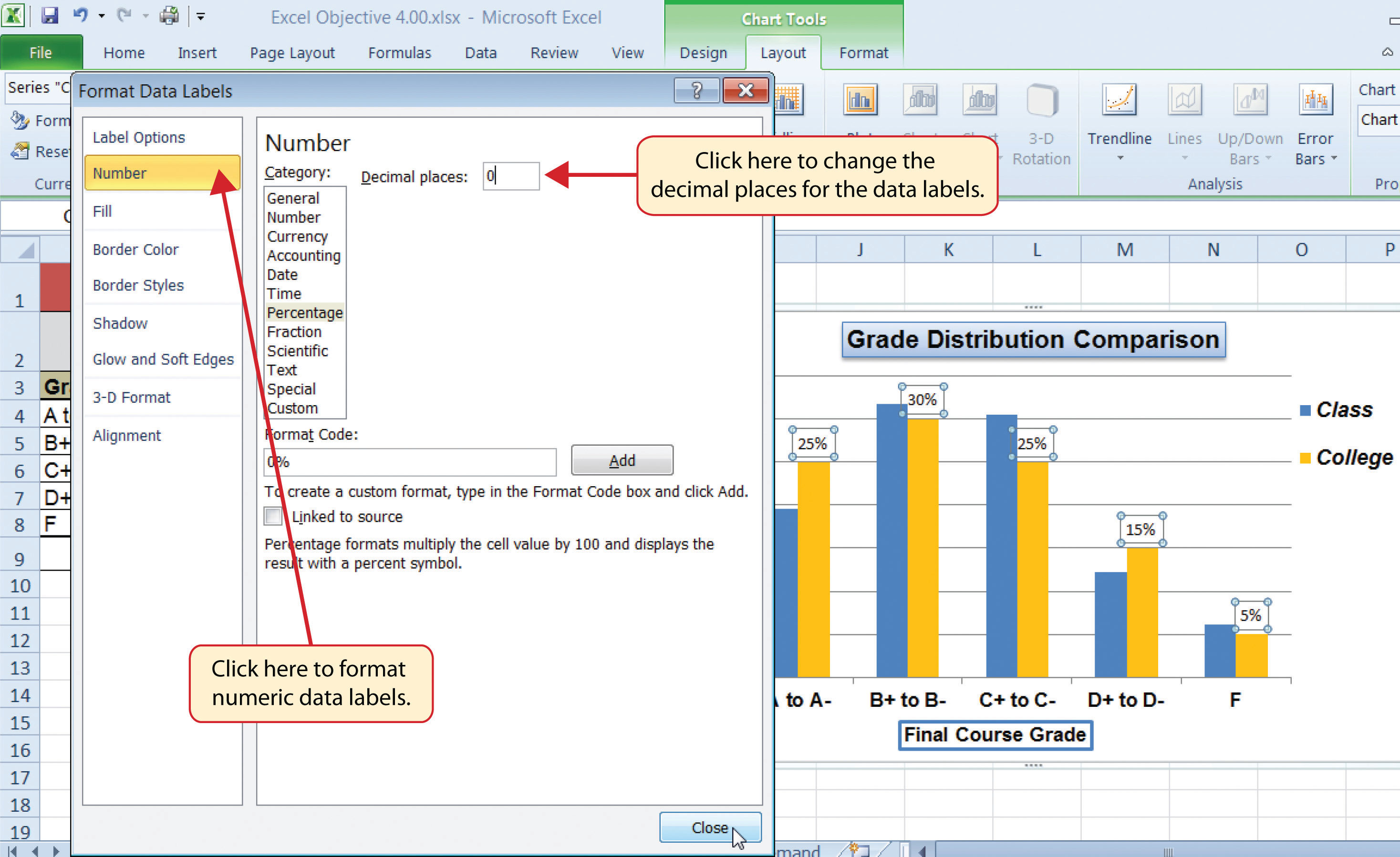
Figure 4.35 "Completed Formatting Adjustments for the Data Series" shows the Grade Distribution Comparison chart with the completed formatting adjustments and labels added to the data series. Note that we can move each individual data label. This might be necessary if two data labels overlap or if a data label falls in the middle of a grid line. To move an individual data label, click it twice, then click and drag.
Figure 4.35 Completed Formatting Adjustments for the Data Series
Skill Refresher: Adding Data Labels
- Click anywhere on the chart to activate it.
- Click the Layout tab in the Chart Tools section of the Ribbon.
- Click the Data Labels button in the Labels group of commands.
- Select one of the preset positions from the drop-down list or select More Data Label Options to open the Format Data Labels dialog box.
Skill Refresher: Formatting a Data Series
- Click any bar or line for a data series.
- Click either the Home tab or the Format tab of the Ribbon.
- Select any of the available formatting commands in these tabs.
Formatting the Plot and Chart Areas
Follow-along file: Continue with Excel Objective 4.00. (Use file Excel Objective 4.12 if starting here.)
The last items we will format on the Grade Distribution Comparison chart are the plot and chart areas. We format these areas primarily to enhance the visibility of the data series. The following steps explain how to add these formatting enhancements to the chart:
- Click anywhere in the chart area of the Grade Distribution Comparison chart in the Grade Distribution worksheet.
- Click the Format tab in the Chart Tools section of the Ribbon.
- Click the down arrow on the Shape Fill button in the Shape Styles group of commands.
- Select the Tan, Background 2, Darker 25% option from the color palette (see Figure 4.36 "Formatting the Chart Area").
- Click anywhere in the plot area to activate it. Be sure not to click a grid line or one of the data series.
- Click the Format tab in the Chart Tools section of the Ribbon.
- Click the Shape Effects button in the Shape Styles group of commands.
- Place the mouse pointer over the Bevel option from the drop-down list. Then select the Circle bevel option from the second drop-down list (see Figure 4.37 "Putting a Bevel Effect on the Plot Area").
Figure 4.36 Formatting the Chart Area
Figure 4.37 Putting a Bevel Effect on the Plot Area
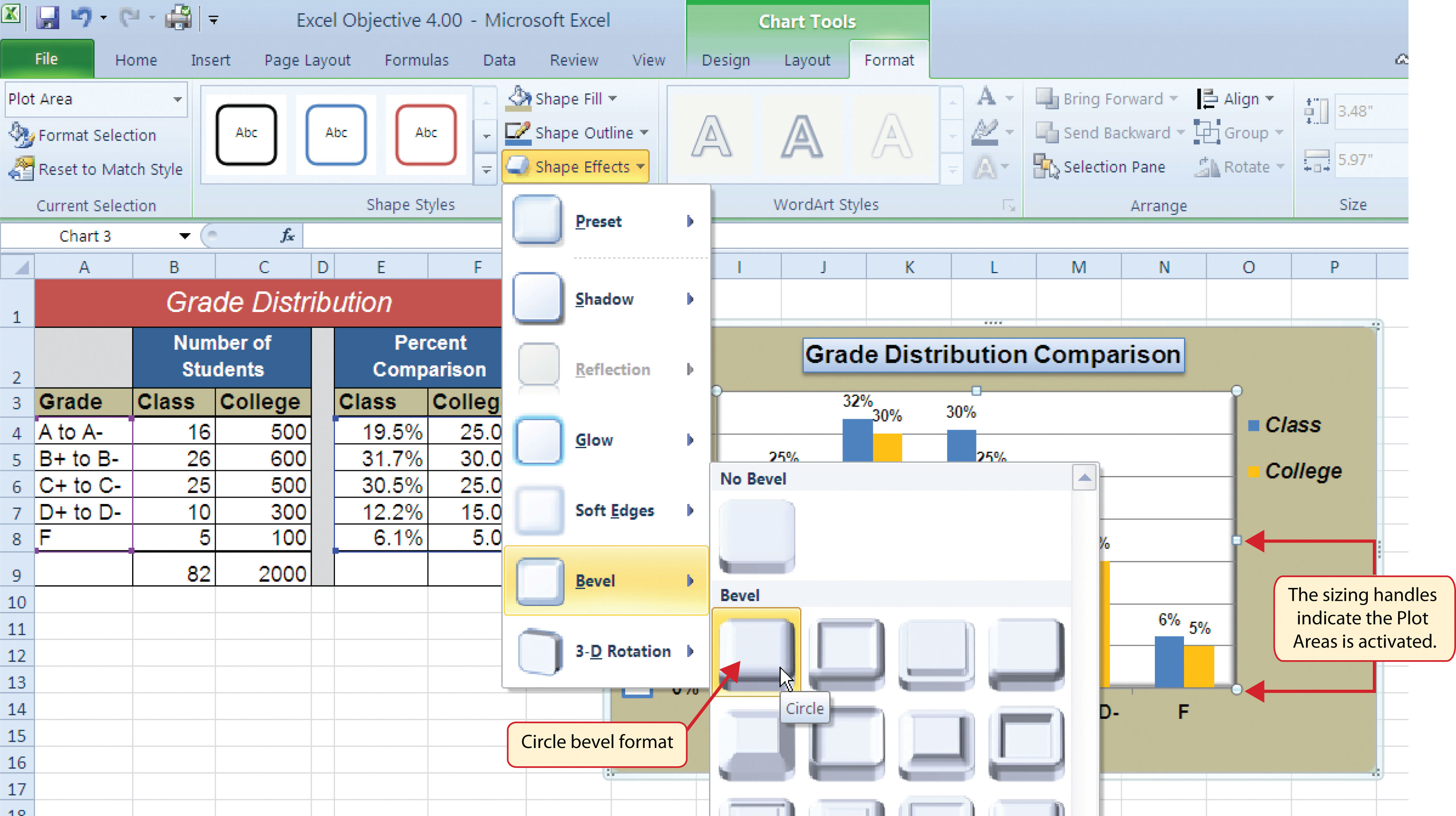
Figure 4.38 "Grade Distribution Comparison Chart with Formats Applied" shows the completed Grade Distribution Comparison chart. The darker shade on the chart area along with the bevel effect on the plot area make the data series the main focal point of the chart.
Figure 4.38 Grade Distribution Comparison Chart with Formats Applied
Skill Refresher: Formatting the Chart Area
- Click anywhere on the chart area.
- Click either the Home tab or the Format tab of the Ribbon.
- Select any of the available formatting commands in these tabs.
Skill Refresher: Formatting the Plot Area
- Click anywhere on the plot area.
- Click either the Home tab or the Format tab of the Ribbon.
- Select any of the available formatting commands in these tabs.
Adding Series Lines and Annotations to a Chart
Follow-along file: Continue with Excel Objective 4.00. (Use file Excel Objective 4.13 if starting here.)
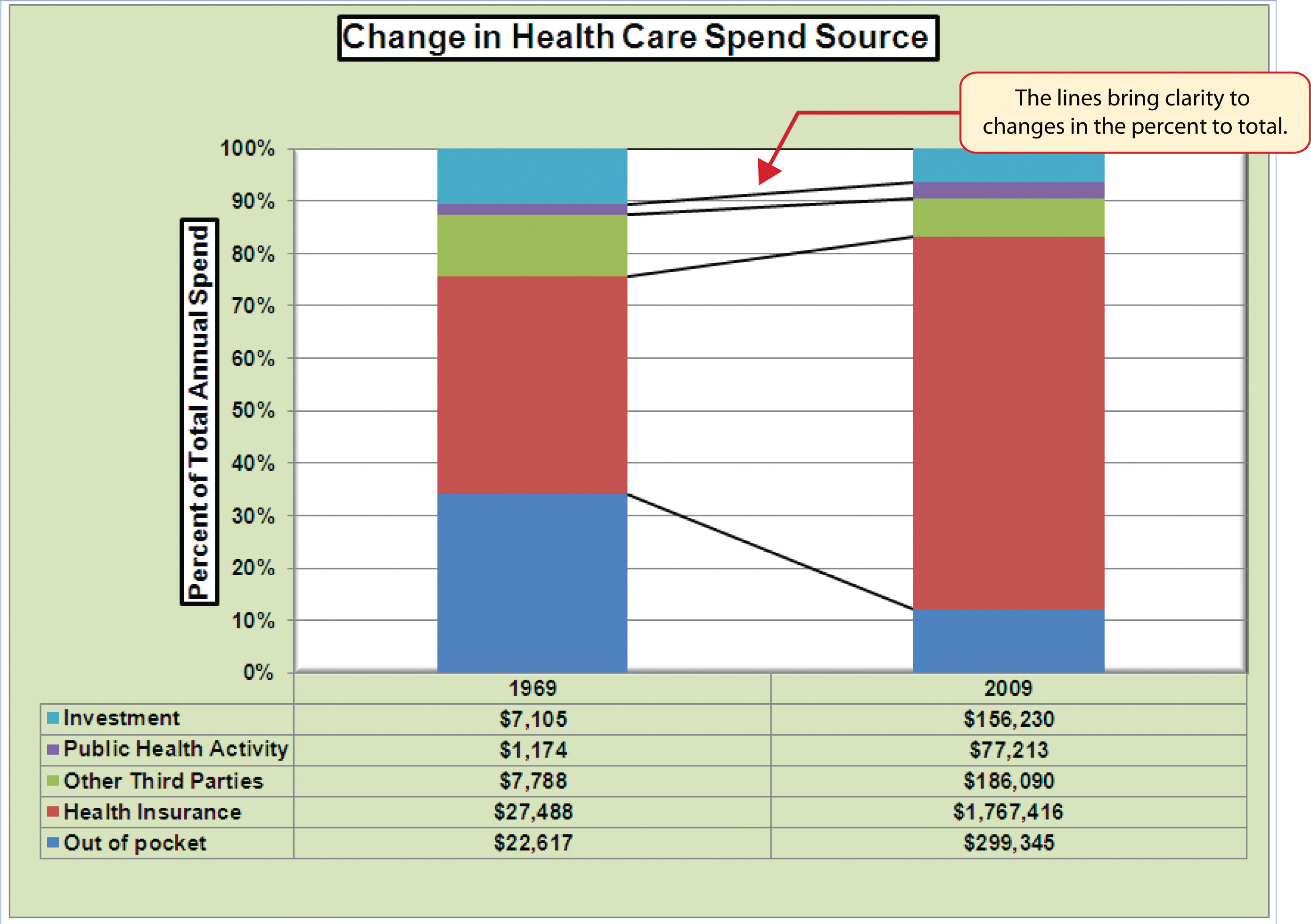
The last formatting features we will demonstrate are adding series lines and annotations to a chart. To demonstrate these skills, we will use the Change in Health Care Spend Source stacked column chart. Series linesLines that are typically used in a stacked column chart to connect the data series between two or more stacks. are commonly used in stacked column charts to show the change from one stack to the next. AnnotationsNotes or comments that explain the nature and source of the data presented on a chart. are useful for clarifying the data presented in a chart or for identifying data sources. In addition to demonstrating these skills, we will review several of the formatting skills that were covered in this section. The following steps include the skills review as well as the new formatting features:
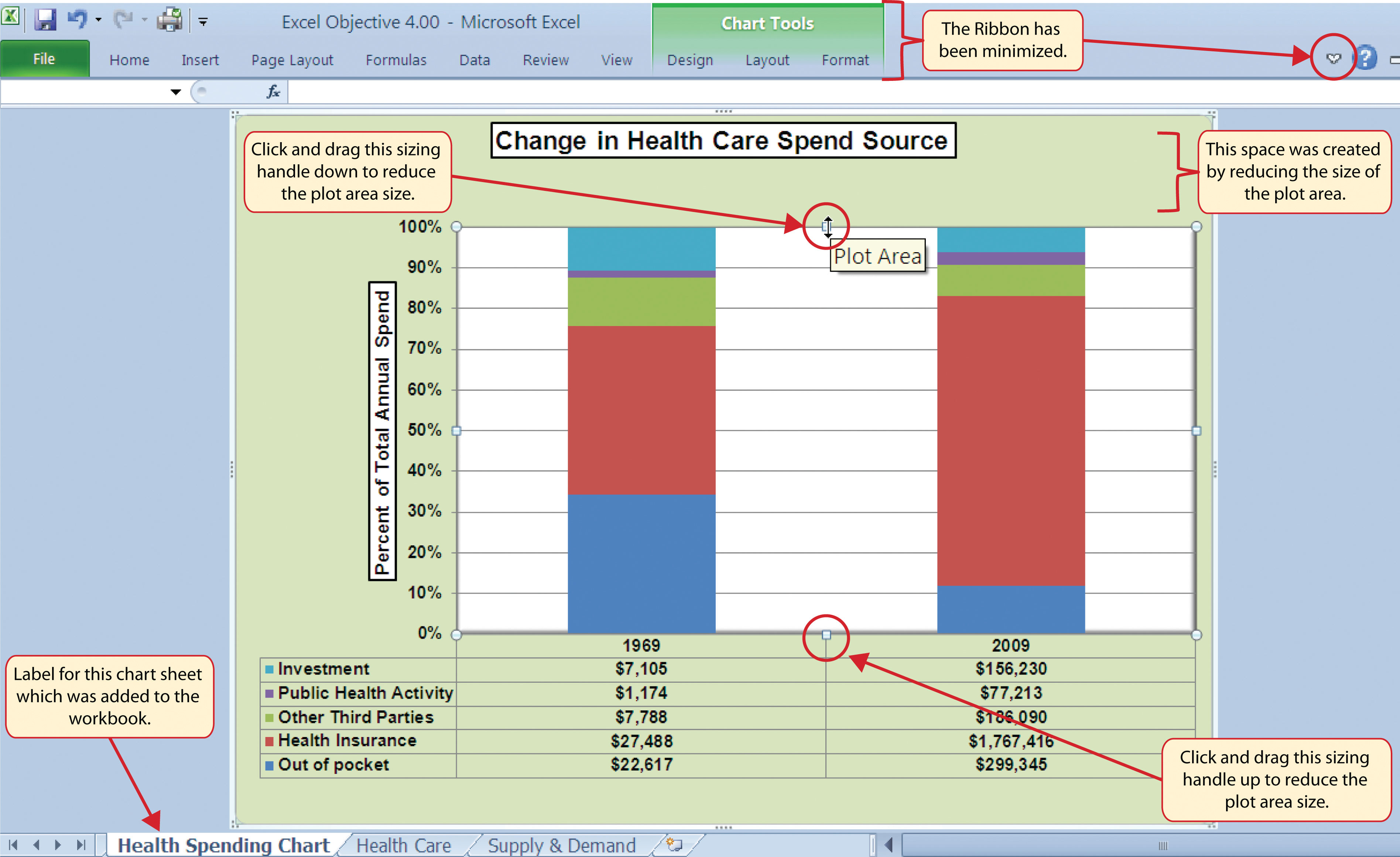
- Locate the Change in Health Care Spend Source chart on the Health Care worksheet. Activate the chart by clicking anywhere inside the chart perimeter.
- Move the chart to a separate chart sheet by clicking the Move Chart button in the Design tab of the Ribbon. Type the following sheet tab label in the New sheet input box: Health Spending Chart. Click the OK button.
- Click anywhere on the X axis to activate it. In the Home tab of the Ribbon, change the font style to Arial, change the font size to 12 points, and select the bold command.
- Activate the Y axis and apply the same formatting adjustments as stated in step 3.
- Add a Y axis title using the Rotated Title option. In the Format tab under the Chart Tools section of the Ribbon, select the first preset style option, Colored Outline - Black, Dark 1, in the Shape Styles group of commands. Then, in the Home tab of the Ribbon, change the font style to Arial and the font size to 14 points.
- Change the wording of the Y axis title to read Percent of Total Annual Spend.
- Activate the title of the chart by clicking it once. In the Format tab under the Chart Tools section of the Ribbon, select the first preset style option, Colored Outline - Black, Dark 1, in the Shape Styles group of commands. Then, in the Home tab of the Ribbon, change the font style to Arial.
- Click anywhere in the chart area to activate it.
- Click the Format tab in the Chart Tools section of the Ribbon and click the down arrow on the Shape Fill button. Select the Olive Green, Accent 3, Lighter 60% option on the color palette.
- Click anywhere on the plot area to activate it. Be sure not to click on a grid line.
- Click the Shape Effects button in the Format tab of the Ribbon. Place the mouse pointer over the Bevel option from the drop-down menu. Select the first option from the Bevel format list, which is the “Circle” bevel option.
- Click and drag down the top center sizing handle of the plot area approximately one inch (see Figure 4.39 "Adjusting the Size of the Plot Area").
-
Click and drag up the bottom center sizing handle approximately three-quarters of an inch (see Figure 4.39 "Adjusting the Size of the Plot Area"). This step and step 12 are necessary to create space at the top and bottom of the chart to add annotations.
Figure 4.39 "Adjusting the Size of the Plot Area" shows the Change in Health Care Spend Source chart prior to adding the series lines and annotations. Notice that the Ribbon has been minimized to improve the visibility of the chart. The remaining steps will focus on adding lines and annotations:
Figure 4.39 Adjusting the Size of the Plot Area
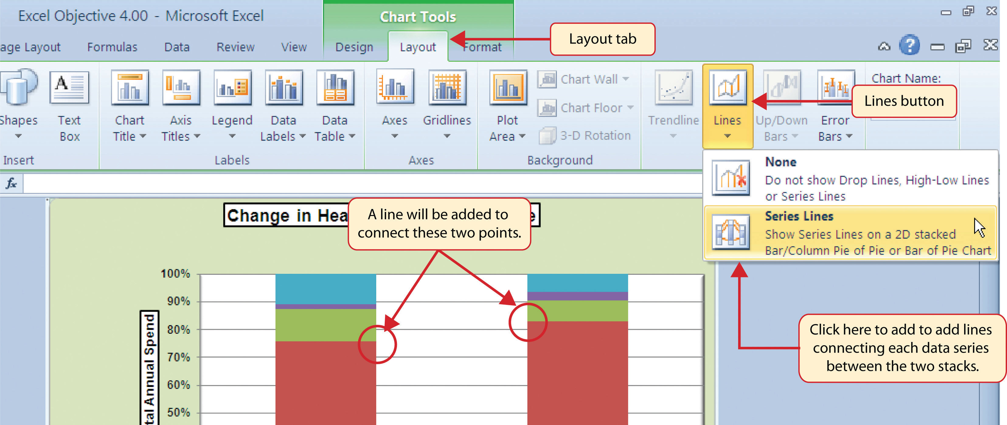
- Click the Layout tab in the Chart Tools section of the Ribbon.
- Click the Lines button in the Analysis group of commands.
-
Click the Series Lines option from the drop-down list. This adds lines to the chart, connecting each data series between the two stacks (see Figure 4.40 "Selecting the Series Lines Option").
Figure 4.40 Selecting the Series Lines Option
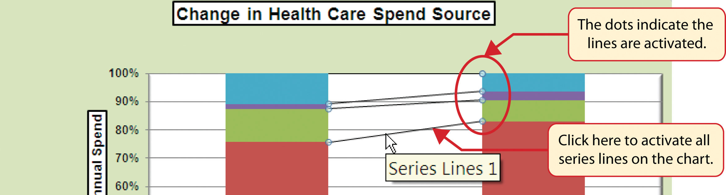
-
Click any of the series lines added to the chart. Clicking one line will activate all lines on the chart (see Figure 4.41 "Activating the Series Lines").
Figure 4.41 Activating the Series Lines
-
Click the Shape Outline button in the Format tab of the Ribbon. Place the mouse pointer over the Weight option and select the “2¼ line weight” option.
Figure 4.42 "Series Lines Added to the Stacked Column Chart" shows the appearance of the chart with the series lines connecting the two stacks. This formatting enhancement is common for stacked column charts. The lines help focus the audience’s attention to changes in the percent of total trend. In this case, the audience can quickly see the decline in the Out of Pocket category (blue) and the increase in the Health Insurance category (red).
Figure 4.42 Series Lines Added to the Stacked Column Chart
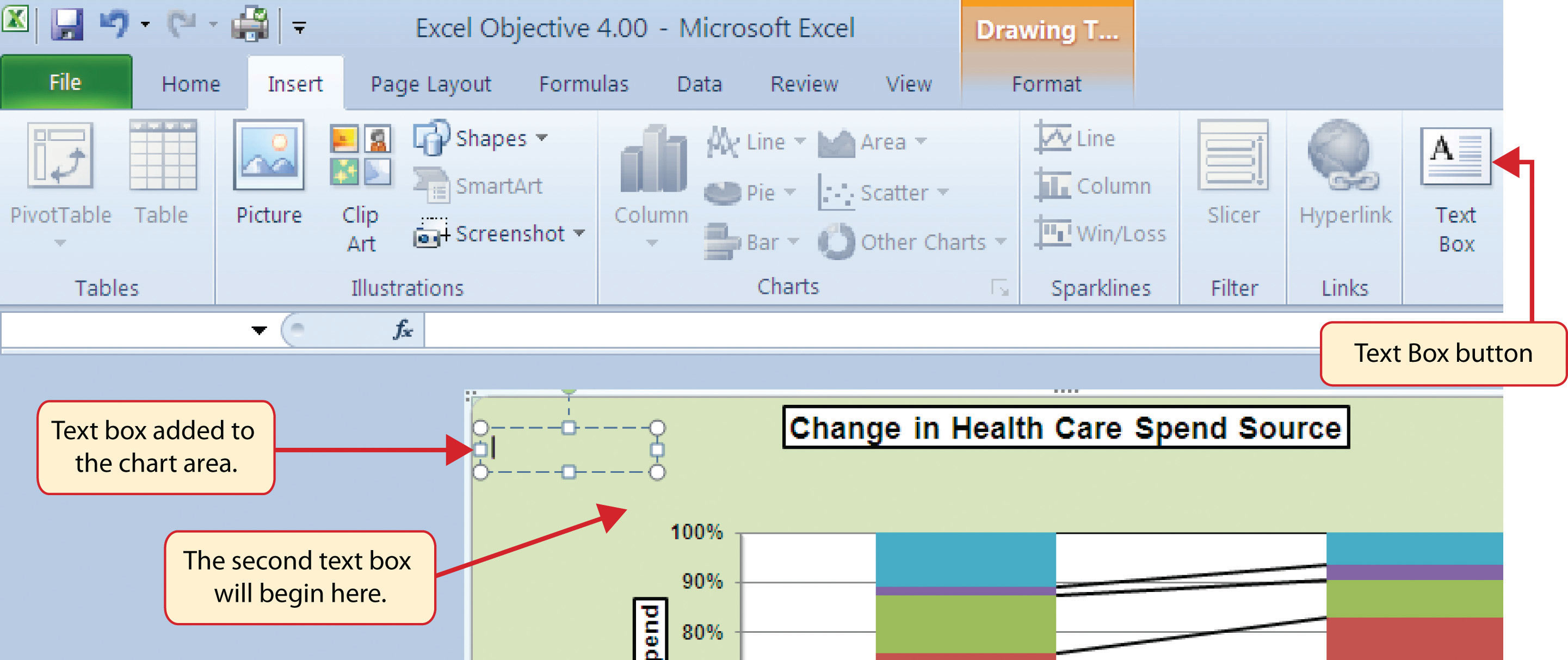
- Click anywhere in the chart area of the Change in Health Care Spend Source chart.
- Click the Text Box button in the Insert tab of the Ribbon (see Figure 4.43 "Lines Added to the Stacked Column Chart").
- Place the mouse pointer on the left edge of the chart area approximately one-quarter inch from the top. Click and drag a rectangle approximately one and a half inches wide and one-quarter inch high (see Figure 4.43 "Lines Added to the Stacked Column Chart").
- Click the Home tab of the Ribbon and change the font style to Arial, change the font size to 10 points, and select the bold and italics commands.
-
Type Dollars in Millions. This tells the audience that the numbers have been truncated and represent denominations in millions. This means you would add six zeros to the end of each number on the chart. Therefore, the Out of Pocket value for 1969 is shown as $22,617 but is actually $22,617,000,000, or $22.6 billion.
Figure 4.43 Lines Added to the Stacked Column Chart
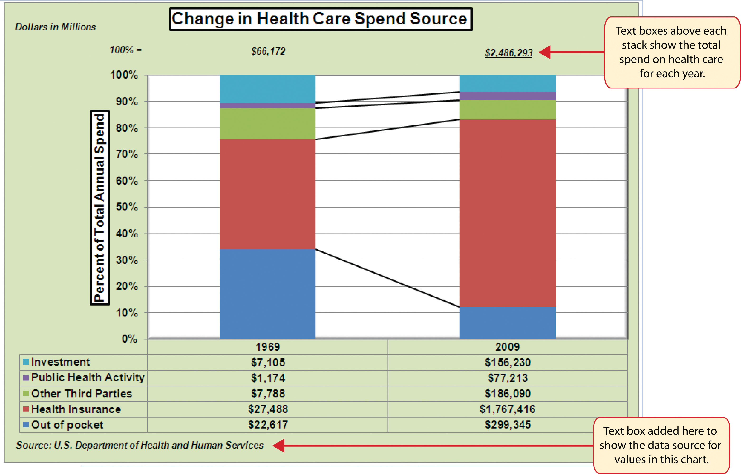
- Repeat steps 19–22 to add a second text box to the chart. Begin drawing this text box below the first box approximately one inch in from the left edge of the chart (see Figure 4.43 "Lines Added to the Stacked Column Chart"). Complete the formatting changes in step 22 and select the Align Text Right command.
- Type 100% = in the second text box.
- Repeat steps 19–22 to add a third text box to the chart. Center this text box over the 1969 stack. In addition to the formatting commands in step 22, select the Center align command and the Underline command.
- Type $66,172 in the third text box.
- Repeat steps 19–22 to add a fourth text box to the chart. Center this text box over the 2009 stack. In addition to the formatting commands in step 22, select the Center align command and the Underline command.
- Type $2,486,293 in the fourth text box.
- Repeat steps 19–22 to add a fifth text box to the chart. Begin drawing this text box at the bottom left edge of the chart, just below the data table. The text box will need to be at least four inches wide.
- Type Source: US Department of Health and Human Services in the fifth text box.
Figure 4.44 "Completed Stacked Column Chart with Annotations" shows the completed Change in Health Care Spend Source stacked column chart. The lines and annotations provide key information for understanding the data and interpreting the trends presented on the chart.
Figure 4.44 Completed Stacked Column Chart with Annotations
Integrity Check
Annotations and Axis Titles
Although adding annotations and axis titles can be a tedious process, doing so maintains a high level of integrity for your charts. People can misinterpret the message being conveyed by the chart if they make inaccurate assumptions about the values displayed. Axis titles and annotations help prevent readers from making false assumptions and ensure that readers see the most accurate representation of the message being conveyed by the chart.
Skill Refresher: Adding Series Lines
- Click anywhere on the chart area.
- Click the Layout tab of the Ribbon.
- Click the Lines button in the Analysis group of commands.
- Click the Series Lines option from the drop-down list.
Skill Refresher: Adding Annotations
- Click anywhere on the chart area.
- Click the Insert tab of the Ribbon.
- Click the Text Box button in the Text group of commands.
- Click and drag the size of the text box needed on the chart.
- Apply any desired format changes from the Home tab of the Ribbon.
- Type the desired text.
Key Takeaways
- Applying appropriate formatting techniques is critical for making a chart easier to read.
- Many formatting commands in the Home tab of the Ribbon can be applied to a chart.
- To change the number format for a data label, you must use the Number section in the Format Data Labels dialog box. You cannot use the Number format commands in the Home tab of the Ribbon.
- To change the number format for the values on the Y axis, and the X axis in the case of a scatter chart, you must use the Number section of the Format Axis dialog box. You cannot use the Number format commands in the Home tab of the Ribbon.
- Axis titles and annotations help prevent false assumptions from being made and ensure that the reader sees the most accurate representation of the information presented on a chart.
Exercises
-
You need to format the numbers along the Y axis of a column chart to US dollars with zero decimal places. Which of the following describes the method that would allow you to accomplish this?
- Activate the Y axis and use any of the number formatting commands in the Home tab of the Ribbon.
- Activate the Y axis and click the Data Labels button in the Layout tab of the Ribbon.
- Activate the Y axis and click the Format Selection button in the Layout tab of the Ribbon.
- Activate the Y axis and click the Axis Titles button in the Layout tab of the Ribbon.
-
Which of the following statements is accurate with regard to changing the color of a data series on a column chart?
- Click one bar on the column chart plot area to activate all bars for that data series. Click the Fill Color button in the Home tab of the Ribbon and select a color.
- Click one bar on the column chart plot area twice to activate all bars for that data series. Click the Shape Fill button in the Format tab of the Ribbon and select a color.
- Click the Legend one time and then click the name of the data series to activate it. Click the Shape Fill button in the Format tab of the Ribbon and select a color.
- Both A and C are valid methods for changing the color of a data series.
-
Which of the following methods is accurate with respect to formatting the legend?
- Click the legend one time and use any of the available formatting commands in the Home tab of the Ribbon.
- Click the Legend button in the Layout tab of the Ribbon and select from the drop-down list of commands.
- Click the legend one time to activate it and use any of the formatting commands in the Design tab of the Ribbon.
- None of the above.
-
Which of the following is the most efficient way to add a title to the Y axis of a chart?
- Add a text box to the plot area and drag it over to the Y axis.
- Type the title into the formula bar. This adds a text box to the plot area that can be dragged over to the Y axis.
- Select the vertical axis option from the Axis Titles button in the Layout tab of the Ribbon.
- Select the axis title option in the Select Data Source dialog box after clicking the Select Data button in the Design tab of the Ribbon.