This is “Color”, section 9.1 from the book Geographic Information System Basics (v. 1.0). For details on it (including licensing), click here.
For more information on the source of this book, or why it is available for free, please see the project's home page. You can browse or download additional books there. To download a .zip file containing this book to use offline, simply click here.


9.1 Color
Learning Objective
- The objective of this section is to gain an understanding the properties of color and how best to utilize them in your cartographic products.
Although a high-quality map is composed of many different elements, color is one of the first components noticed by end-users. This is partially due to the fact that we each have an intuitive understanding of how colors are, and should be, used to create an effective and pleasing visual experience. Nevertheless, it is not always clear to the map-maker which colors should be used to best convey the purpose of the product. This intuition is much like listening to our favorite music. We know when a note is in tune or out of tune, but we wouldn’t necessarily have any idea of how to fix a bad note. Color is indeed a tricky piece of the cartographic puzzle and is not surprisingly the most frequently criticized variable on computer-generated maps (Monmonier 1996).Monmonier, M. 1996. How to Lie with Maps. 2nd ed. Chicago: University of Chicago Press. This section attempts to outline the basic components of color and the guidelines to most effectively employ this important map attribute.
Color Basics
As electromagnetic radiation (ER) travels via waves from the sun (or a lightbulb) to objects on the earth, portions of the ER spectrum are absorbed, scattered, or reflected by various objects. The resulting property of the absorbed, scattered, and reflected ER is termed “color.” White is the color resulting from the full range of the visual spectrum and is therefore considered the benchmark color by which all others are measured. Black is the absence of ER. All other colors result from a partial interaction with the ER spectrum.
The three primary aspects of color that must be addressed in map making are hue, value, and saturation. HueThe dominant wavelength or color associated with a reflecting object. is the dominant wavelength or color associated with a reflecting object. Hue is the most basic component of color and includes red, blue, yellow, purple, and so forth. ValueThe amount of white or black in the color. is the amount of white or black in the color. Value is often synonymous with contrast. Variations in the amount of value for a given hue result in varying degrees of lightness or darkness for that color. Lighter colors are said to possess high value, while dark colors possess low value. Monochrome colors are groups of colors with the same hue but with incremental variations in value. As seen in Figure 9.1 "Value", variations in value will typically lead the viewer’s eye from dark areas to light areas.
Figure 9.1 Value
SaturationThe intensity of color. describes the intensity of color. Full saturation results in pure colors, while low saturation colors approach gray. Variations in saturation yield different shades and tints. ShadesGray-toned colors produced by adding black to the original hue. are produced by blocking light, such as by an umbrella, tree, curtain, and so forth. Increasing the amount of shading results in grays and blacks. TintColors produced by adding white to the original hue. is the opposite of shade and is produced by adding white to a color. Tints and shades are particularly germane when using additive color models (see Section 9.1.2 "Color Models" for more on additive color models). To maximize the interpretability of a map, use saturated colors to represent hierarchically prominent features and washed-out colors to represent background features.
If used properly, color can greatly enhance and support map design. Likewise, color can detract from a mapping product if abused. To use color properly, one must first consider the purpose of the map. In some cases, the use of color is not warranted. Grayscale maps can be just as effective as color maps if the subject matter merits it. Regardless, there are many reasons to use color. The five primary reasons are outlined here.
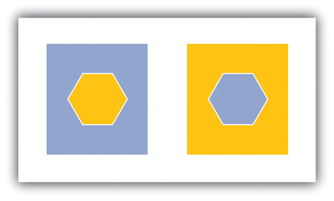
Color is particularly suited to convey meaning (Figure 9.2 "Use of Color to Provide Meaning"). For example, red is a strong color that evokes a passionate response in humans. Red has been shown to evoke physiological responses such as increasing the rate of respiration and raising blood pressure. Red is frequently associated with blood, war, violence, even love. On the other hand, blue is a color associated with calming effects. Associated with the sky or ocean, blue colors can actually assist in sleep and is therefore a recommended color for bedrooms. Too much blue, however, can result in a lapse from calming effects into feelings of depression (i.e., having the “blues”). Green is most commonly associated with life or nature (plants). The color green is certainly one of the most topical colors in today’s society with commonplace references to green construction, the Green party, going green, and so forth. Green, however, can also represent envy and inexperience (e.g., the green-eyed monster, greenhorn). Brown is also a nature color but more as a representation of earth and stone. Brown can also imply dullness. Yellow is most commonly associated with sunshine and warmth, somewhat similar to red. Yellow can also represent cowardice (e.g., yellow-bellied). Black, the absence of color, is possibly the most meaning-laden color in modern parlance. Even more than the others, the color black purports surprisingly strong positive and negative connotations. Black conveys mystery, elegance, and sophistication (e.g., a black-tie affair, in the black), while also conveying loss, evil, and negativity (e.g., blackout, black-hearted, black cloud, blacklist).
Figure 9.2 Use of Color to Provide Meaning
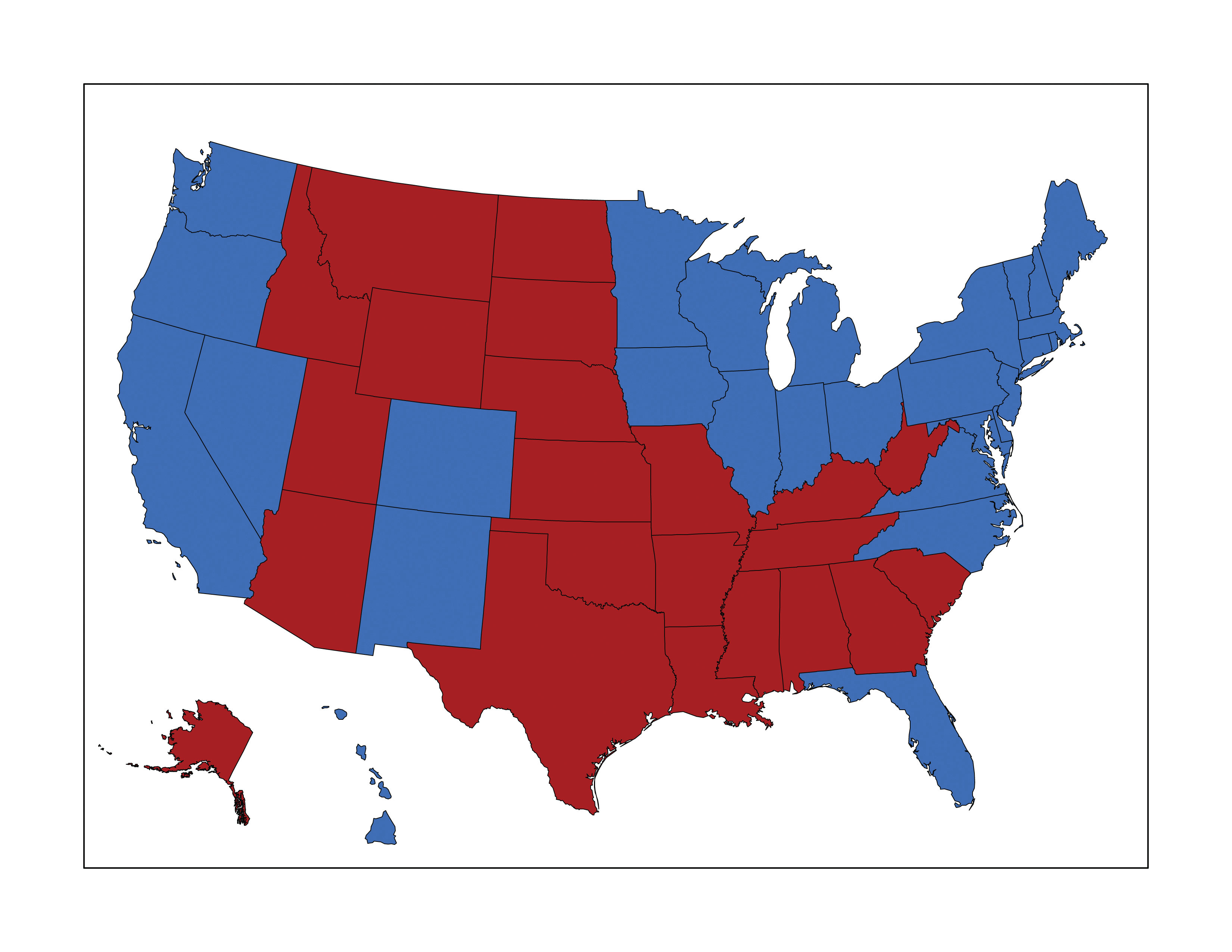
In this map, red counties are those that voted for the Republican Party in the 2004 presidential election, while blue counties voted Democrat. These colors are typically used to designate the Democratic and Republican Parties.
The second reason to use color is for clarification and emphasis (Figure 9.3 "Use of Color to Provide Emphasis"). Warm colors, such as reds and yellows, are notable for emphasizing spatial features. These colors will often jump off the page and are usually the first to attract the reader’s eye, particularly if they are counterbalanced with cool colors, such as blues and greens (see Section 9.1.3 "Color Choices" for more on warm and cool colors). In addition, the use of a hue with high saturation will stand out starkly against similar hues of low saturation.
Figure 9.3 Use of Color to Provide Emphasis
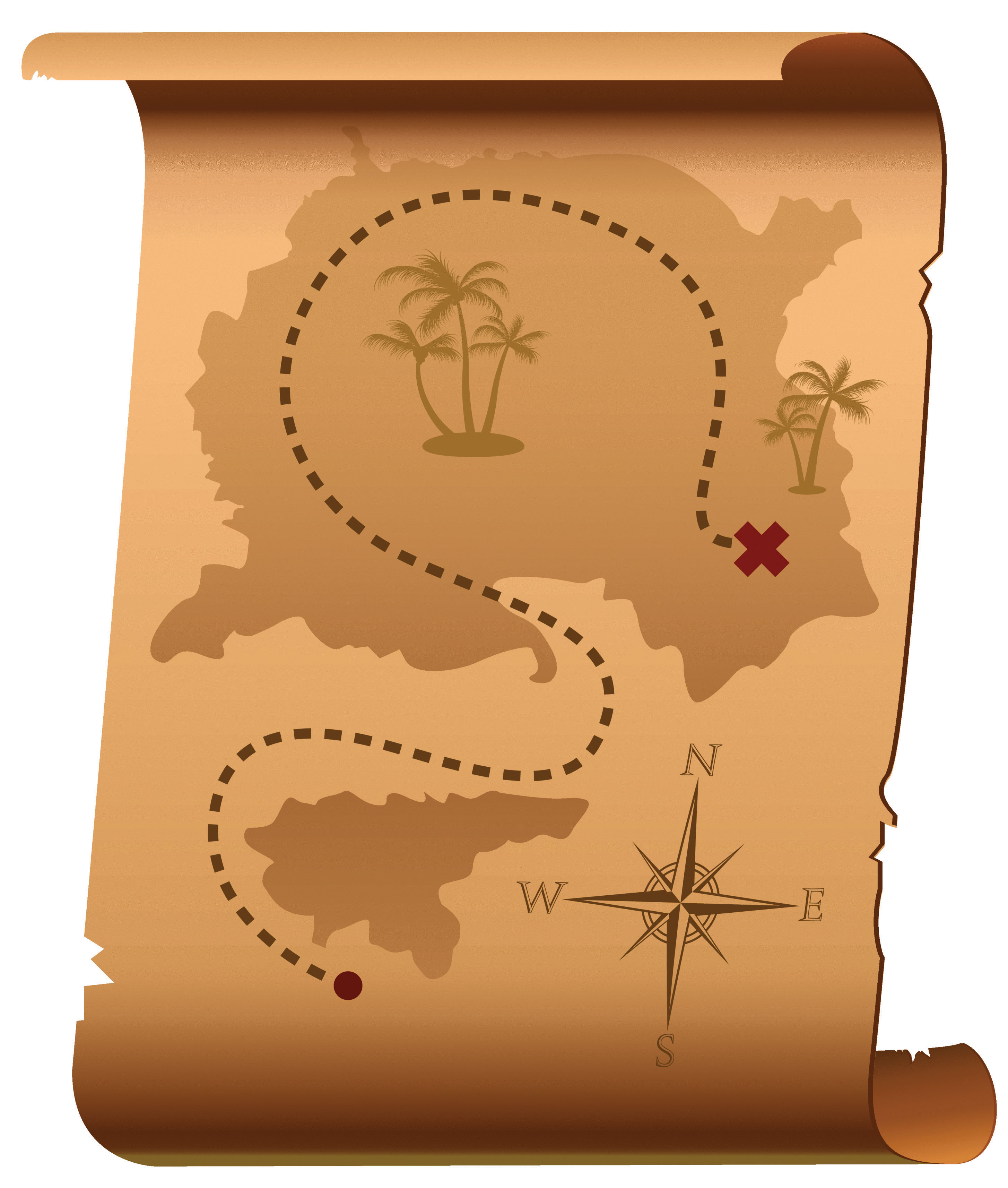
Red marks the spot!
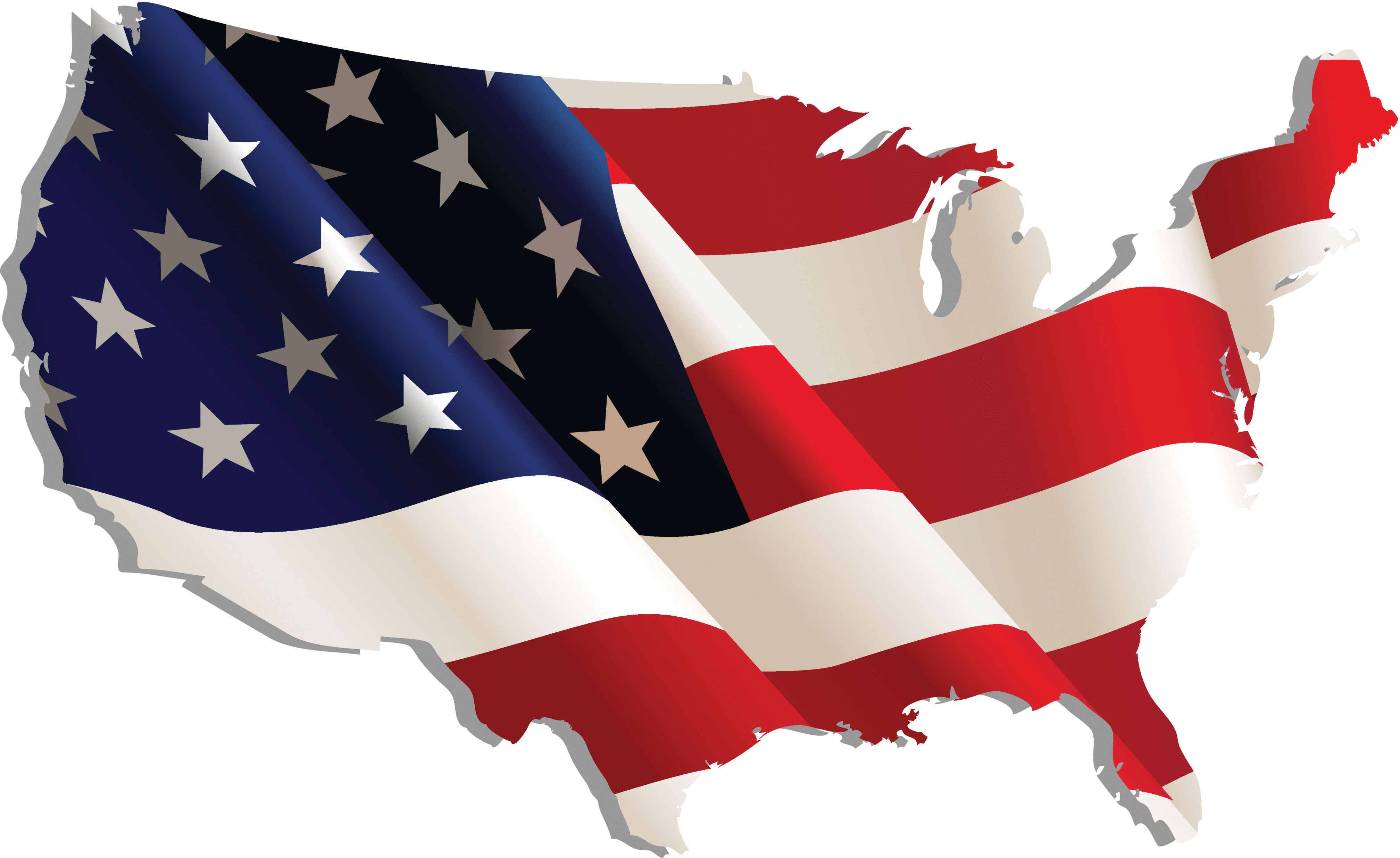
Color use is also important for creating a map with pleasing aesthetics (Figure 9.4 "Use of Color to Provide Aesthetics"). Certainly, one of the most challenging aspects of map creation is developing an effective color palette. When looking at maps through an aesthetic lens, we are truly starting to think of our creations as artwork. Although somewhat particular to individual viewers, we all have an innate understanding of when colors in a graphic/art are aesthetically pleasing and when they are not. For example, color use is considered harmonious when colors from opposite sides of the color wheel are used (Section 9.1.3 "Color Choices"), whereas equitable use of several major hues can create an unbalanced image.
Figure 9.4 Use of Color to Provide Aesthetics
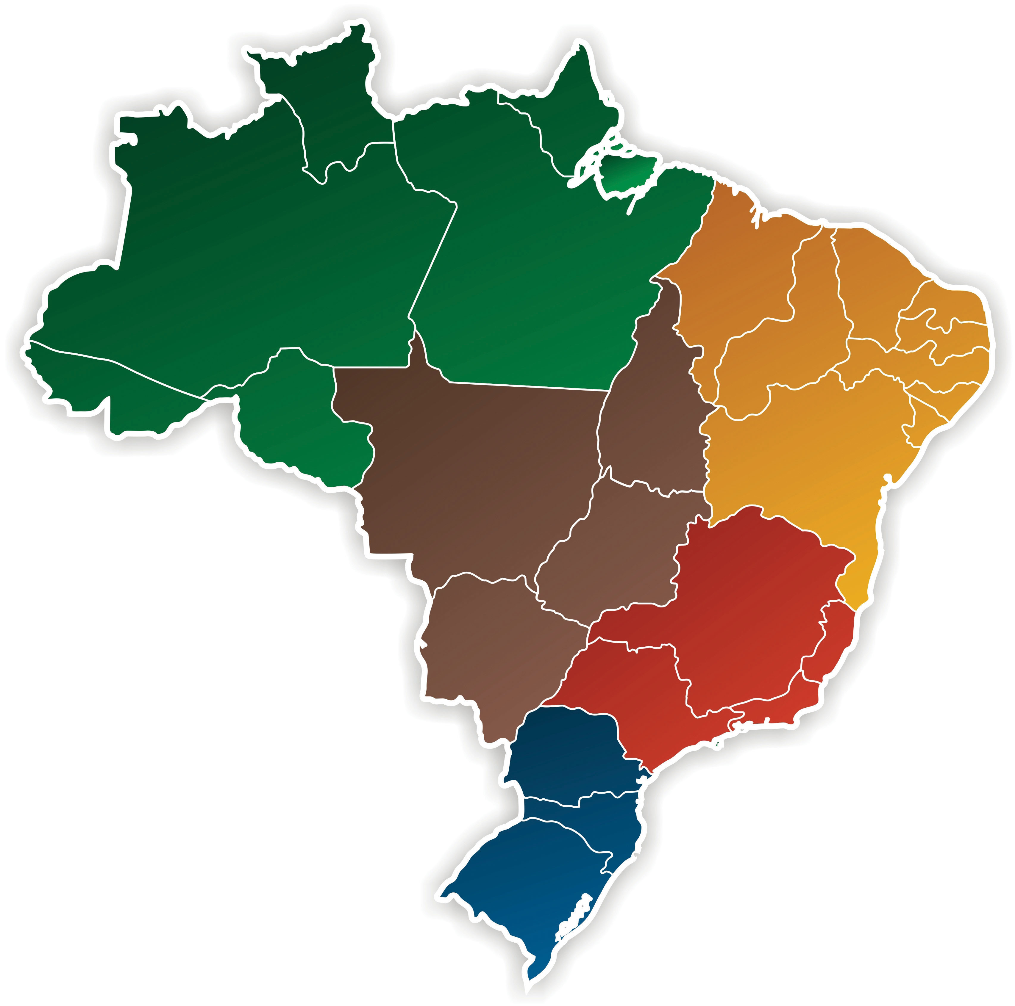
The fourth use of color is abstraction (Figure 9.5 "Use of Color to Provide Abstraction"). Color abstraction is an effective way to illustrate quantitative and qualitative data, particularly for thematic products such as choropleth maps. Here, colors are used solely to denote different values for a variable and may not have any particular rhyme or reason. Figure 9.5 "Use of Color to Provide Abstraction" shows a typical thematic map with abstract colors representing different countries.
Figure 9.5 Use of Color to Provide Abstraction
Opposite abstraction, color can also be used to represent reality (Figure 9.6). Maps showing elevation (e.g., digital elevation models or DEMs) are often given false colors that approximate reality. Low areas are colored in variations of green to show areas of lush vegetation growth. Mid-elevations (or low-lying desert areas) are colored brown to show sparse vegetation growth. Mountain ridges and peaks are colored white to show accumulated snowfall. Watercourses and water bodies are colored blue. Unless there is a specific reason not to, natural phenomena represented on maps should always be colored to approximate their actual color to increase interpretability and to decrease confusion.
Figure 9.6
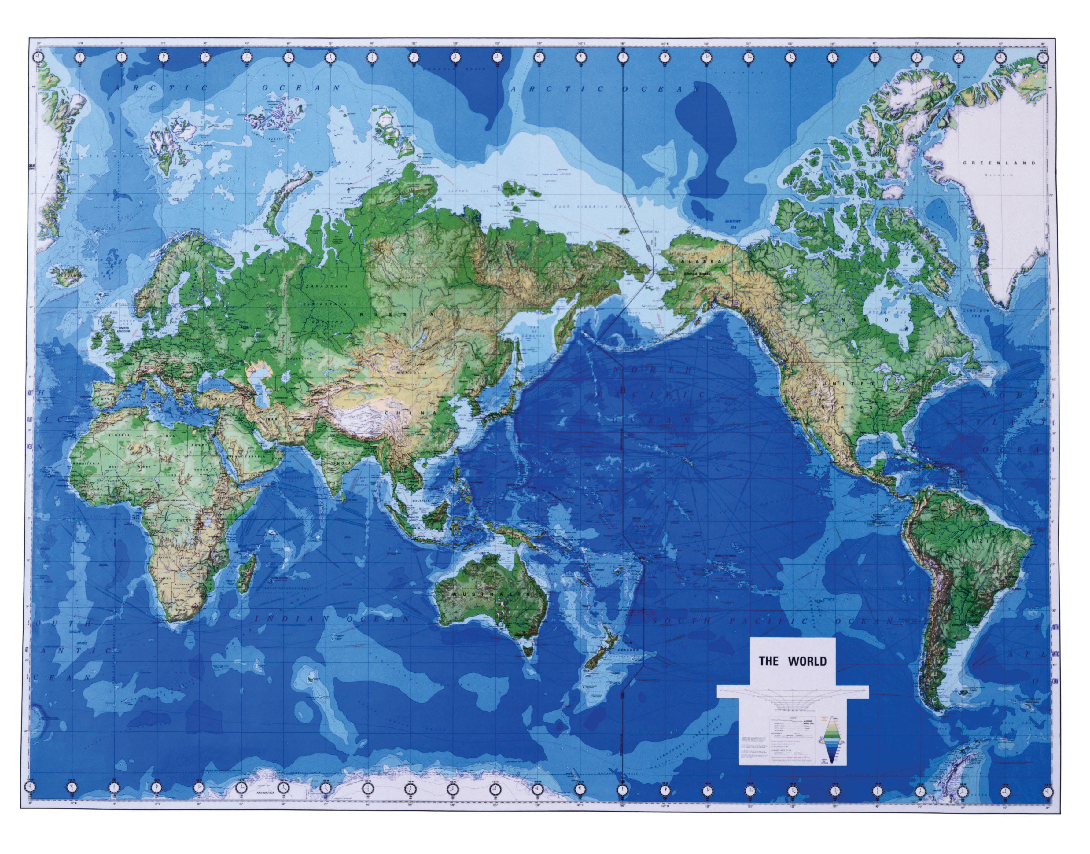
Greens, blues, and browns are used to imitate real-world phenomena.
Color Models
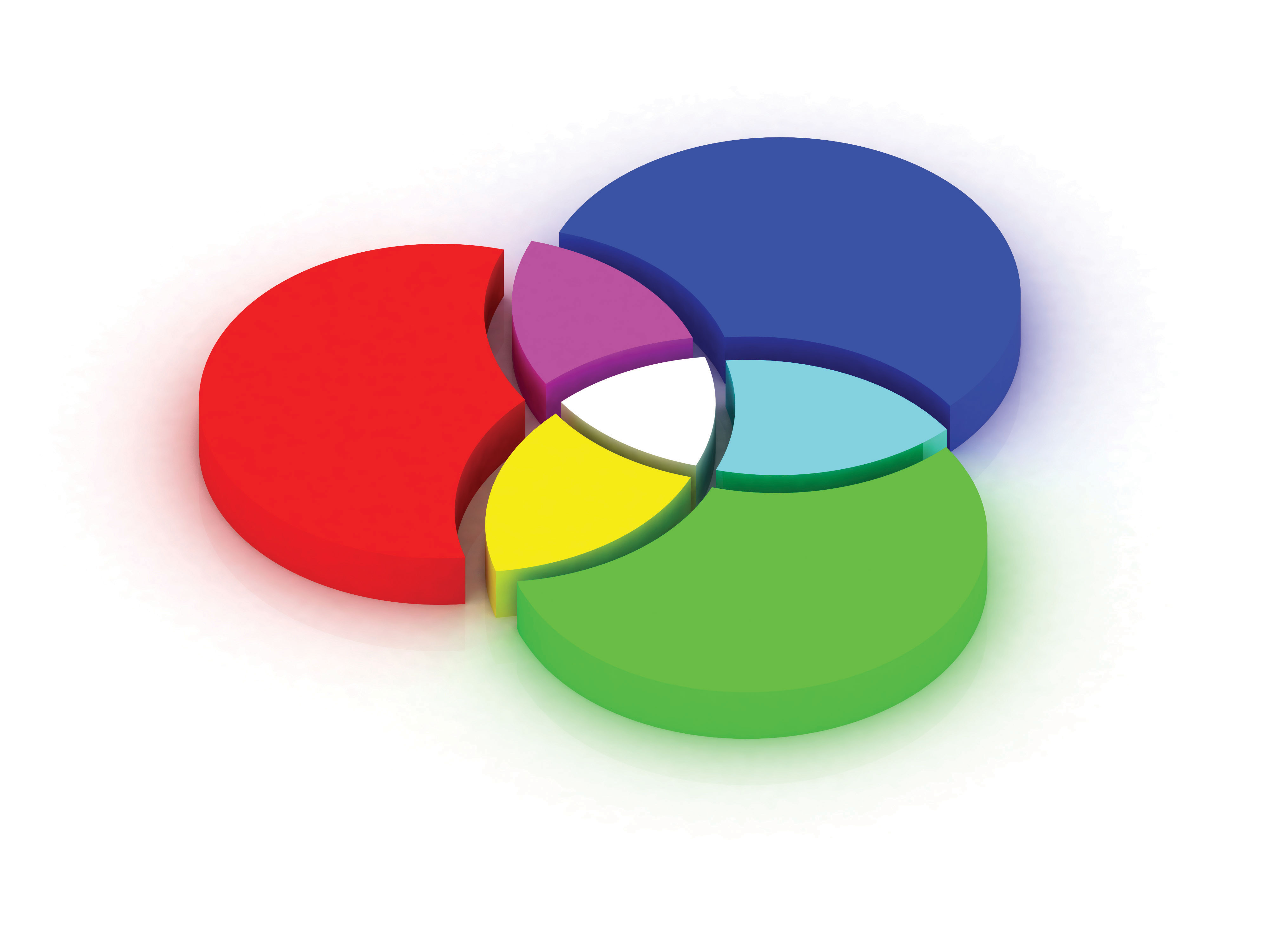
Color models are systems that allow for the creation of a range of colors from a short list of primary colors. Color models can be additive or subtractive. Additive color modelsColor models that combine emitted light to display color variations and are commonly used with computer monitors, televisions, scanners, digital cameras, and video projectors. combine emitted light to display color variations and are commonly used with computer monitors, televisions, scanners, digital cameras, and video projectors. The RGBThe red-green-blue color model. (red-green-blue) color model is the most common additive model (part (a) of Figure 9.7 "Additive Color Models: (a) RGB, (b) HSL, and (c) HSV"). The RGB model combines light beams of the primary hues of red, green, and blue to yield additive secondary hues of magenta, cyan, and yellow. Although there is a substantive difference between pure yellow light (~580 nm) and a mixture of green and red light, the human eye perceives these signals as the same. The RGB model typically employs three 8-bit numeric values (called an RGB triplet) ranging from 0 to 255 to model colors. For instance, the RGB triplets for the pure primary and secondary colors are as follows:
- Red = (255, 0, 0)
- Green = (0, 255, 0)
- Blue = (0, 0, 255)
- Magenta = (255, 0, 255)
- Cyan = (0, 255, 255)
- Yellow = (255, 255, 0)
- Black, the absence of additive color = (0, 0, 0)
- White, the sum of all additive color = (255, 255, 255)
Two other common additive color models, based on the RGB model, are the HSLThe hue-saturation-lightness color model. (hue, saturation, lightness) and HSVThe hue-saturation-value color model. (hue, saturation, value) models (Figure 9.7 "Additive Color Models: (a) RGB, (b) HSL, and (c) HSV", b and c). These models are based on cylindrical coordinate systems whereby the angle around the central vertical axis corresponds to the hue; the distance from the central axis corresponds to saturation; and the distance along the central axis corresponds to either saturation or lightness. Because of their basis in the RGB model, both the HSL and HSV color models can be directly transformed between the three additive models. While these relatively simple additive models provide minimal computer-processing time, they do possess the disadvantage of glossing over some of the complexities of color. For example, the RGB color model does not define “absolute” color spaces, which connotes that these hues may look differently when viewed on different displays. Also, the RGB hues are not evenly spaced along the color spectrum, meaning combinations of the hues is less than exact.
Figure 9.7 Additive Color Models: (a) RGB, (b) HSL, and (c) HSV
In contrast to an additive model, subtractive color modelsColor models that involve the mixing of paints, dyes, or inks on a white page to create full color ranges. involve the mixing of paints, dyes, or inks to create full color ranges. These subtractive models display color on the assumption that white, ambient light is being scattered, absorbed, and reflected from the page by the printing inks. Subtractive models therefore create white by restricting ink from the print surface. As such, these models assume the use of white paper as other paper colors will result in skewed hues. CMYKThe cyan-magenta-yellow-black color model. (cyan, magenta, yellow, black) is the most common subtractive color model and is occasionally referred to as a “four-color process” (Figure 9.8 "Subtractive Color Model: CMYK"). Although the CMY inks are sufficient to create all of the colors of the subtractive rainbow, a black ink is included in this model as it is much cheaper than using a CMY mix for all blacks (black being the most commonly printed color) and because combining CMY often results in more of a dark brown hue. The CMYK model creates color values by entering percentages for each of the four colors ranging from 0 percent to 100 percent. For example, pure red is composed of 14 percent cyan, 100 percent magenta, 99 percent yellow, and 3 percent black.
As you may guess, additive models are the preferred choice when maps are to be displayed on a computer monitor, while subtractive models are preferred when printing. If in doubt, it is usually best to use the RGB model as this supports a larger percentage of the visible spectrum in comparison with the CMYK model. Once an image is converted from RGB to CMYK, the additional RGB information is irretrievably lost. If possible, collecting both RGB and CMYK versions of an image is ideal, particularly if your graphic is to be both printed and placed online. One last note, you will also want to be selective in your use of file formats for these color models. The JPEG and GIF graphic file formats are the best choice for RGB images, while the EPS and TIFF graphic file formats are preferred with printed CMYK images.
Figure 9.8 Subtractive Color Model: CMYK

Color Choices
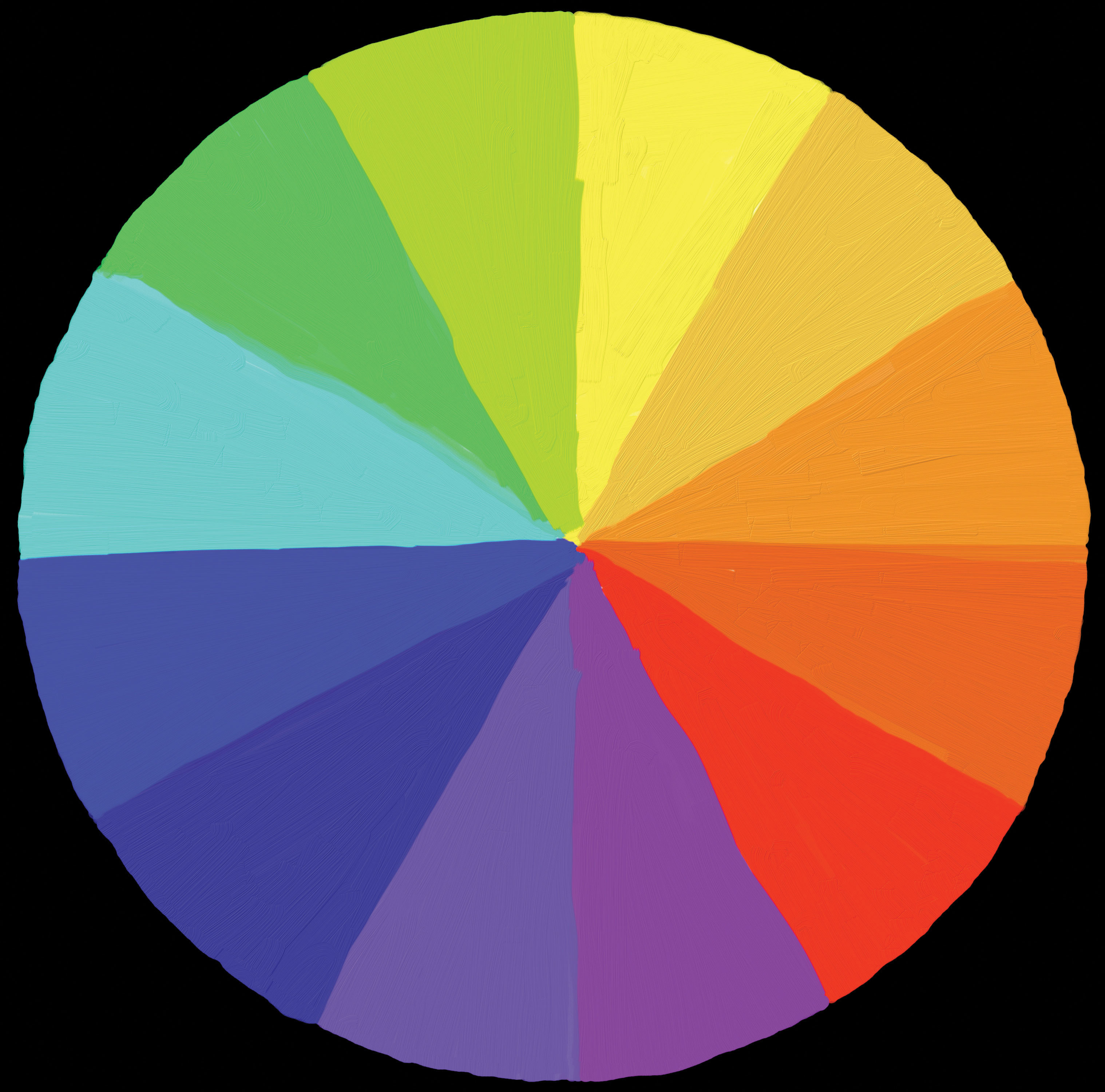
Effective color usage requires a modicum of knowledge about the color wheel. Invented by Sir Isaac Newton in 1706, the color wheelA visual representation of colors arranged according to their chromatic relationships. is a visual representation of colors arranged according to their chromatic relationships. Primary hues are equidistant from each other with secondary and tertiary colors intervening. The red-yellow-blue color wheel is the most frequently used (Figure 9.9 "Color Wheel"); however, the magenta-yellow-cyan wheel is the preferred choice of print makers (for reasons described in the previous section). Primary colors are those that cannot be created by mixing other colors; secondary colors are defined as those colors created by mixing two primary hues; tertiary colors are those created by mixing primary and secondary hues. Furthermore, complementary colors are those placed opposite each on the wheel, while analogous colors are located proximal to each other. Complementary colors emphasize differences. Analogues suggest harmony.
Figure 9.9 Color Wheel
Colors can be further referred to as warm or cool (Figure 9.10 "Warm (Orange) and Cool (Blue) Colors"). Warm colorsThe yellows and reds of the color spectrum associated with fire, heat, sun, and warmer temperatures. are those that might be seen during a bright, sunny day. Cool colorsThe greens and blues of the color spectrum associated with water, sky, ice, and cooler temperatures. are those associated with overcast days. Warm colors are typified by hues ranging from red to yellow, including browns and tans. Cool color hues range from blue-green through blue-violet and include the majority of gray variants. When used in mapping, it is wise to use warm and cool colors with care. Indeed, warm colors stand out, appear active, and stimulate the viewer. Cool colors appear small, recede, and calm the viewer. As you might guess, it is important that you apply warm colors to the map features of primary interest, while using cool colors on the secondary, background, and/or contextual features.
Figure 9.10 Warm (Orange) and Cool (Blue) Colors
Note that the warm color stands out, while the cool color recedes.
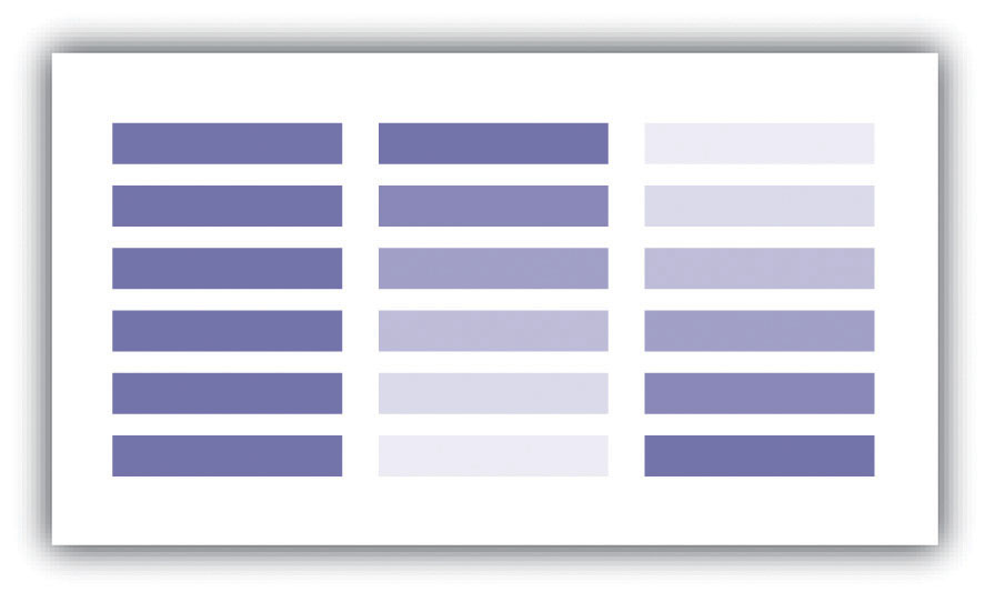
In light of the plethora of color schemes and options available, it is wise to follow some basic color usage guidelines. For example, changes in hue are best suited to visualizing qualitative data, while changes in value and saturation are effective at visualizing quantitative data. Likewise, variations in lightness and saturation are best suited to representing ordered data since these establish hierarchy among features. In particular, a monochromatic color scale is an effective way to represent the order of data whereby light colors represent smaller data values and dark colors represent larger values. Keep in mind that it is best to use more light shades than dark ones as the human eye can better discern lighter shades. Also, the number of coincident colors that can be distinguished by humans is around seven, so be careful not to abuse the color palette in your maps. If the data being mapped has a zero point, a dichromatic scale (Figure 9.11) provides a natural breaking point with increasing color values on each end of the scale representing increasing data values.
Figure 9.11
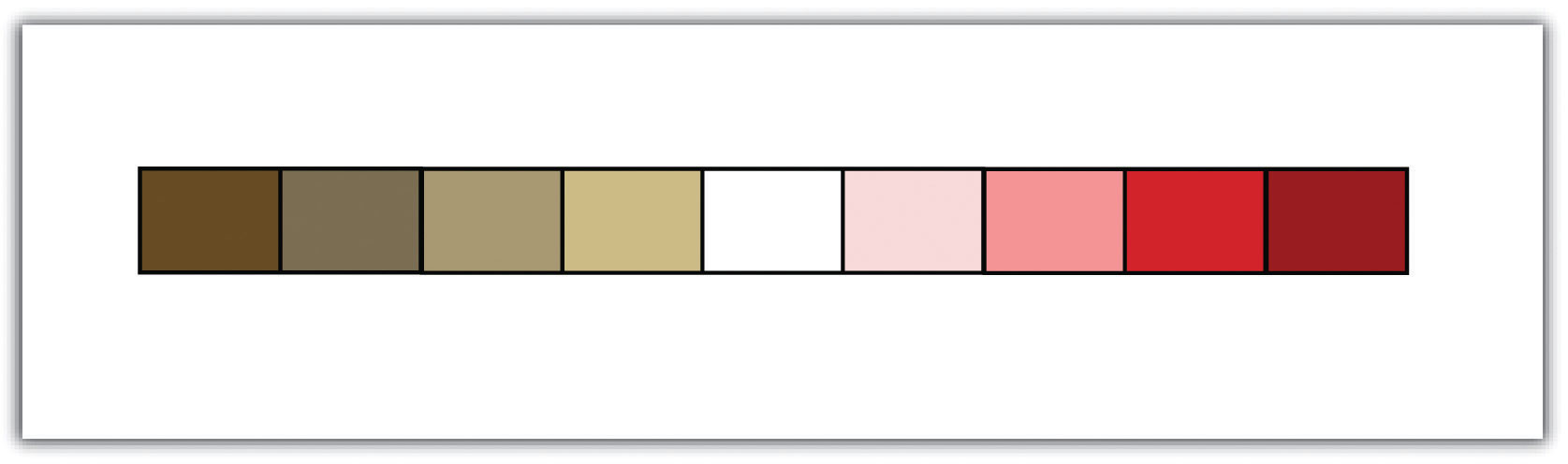
A dichromatic scale is essentially two monochromatic scales joined by a low color value in the center.
In addition, darker colors result in more important or pronounced graphic features (assuming the background is not overly dark). Use dark colors on features whose visual impact you wish to magnify. Finally, do not use all the colors of the spectrum in a single map. It is best to leave such messy, rainbow-spectacular effects to the late Jackson Pollock and his abstract expressionist ilk.
Key Takeaways
- Colors are defined by their hue, value, saturation, shade, and tint.
- Colors are used to convey meaning, clarification and emphasis, aesthetics, abstraction, and reality.
- Color models can be additive (e.g., RGB) or subtractive (e.g., CMYK).
- The color wheel is a powerful tool that assists in the selection of colors for your cartographic products.
Exercises
- Go online and find a map that uses color effectively. Explain.
- Go online and find a map that uses color ineffectively. Explain.