This is “Software and Technology Exercises”, section 10.7 from the book Beginning Project Management (v. 1.1). For details on it (including licensing), click here.
For more information on the source of this book, or why it is available for free, please see the project's home page. You can browse or download additional books there. To download a .zip file containing this book to use offline, simply click here.
10.7 Software and Technology Exercises
Learning Objectives
- Predict likely range of values in a normal distribution.
- Recognize assignable and unassignable causes of statistical variation.
Predicting Value Ranges Using Standard Deviation
Real production processes are never perfect. In some cases, a few products that are too small or that do not work will just cause inconvenience, but in other cases they might be life threatening. Samples of the production process will show how much variation occurs. If it appears that the variations are distributed equally above and below the mean (average), it might be assumed that the statistics of a normal distribution can be used to predict the percentage of products that will be defective when many of them are produced even if none of the samples are defective.
Some projects are initiated to increase the quality by reducing the variation in production. To understand the language of statistics and how it is used to justify a project, it is useful to gain a “feel” for how the distribution of samples is described by the standard deviation. A spreadsheet can be used to simulate samples of production runs where the mean and standard deviation can be chosen to show their relationship in a normal distribution. By trying different values for the standard deviation and observing the effect on the distribution of estimated samples in a chart, you can develop a sense of how the two are related.
Recall that a standard deviation is called a sigma and represented by the Greek letter σ and the 68-95-99.7 rule refers to the percentage of samples that will be within one, two, and three standard deviations of the mean.
Examine a Normal Distribution
Complete the exercise by following these instructions:
- Navigate to the directory location where the exercise files for this unit are located and open Ch10STD.xls in a spreadsheet program such as MS Excel.
- In cell A2, replace StudentName with your name.
- This worksheet is designed to simulate a set of sample values that vary from the mean for random reasons and form a normal distribution. The data and calculations in columns A through F are hidden. They are used to calculate the values in column G on which the chart is based.
-
Notice the following features of the spreadsheet:
- Column A has bins. In this example, the bins are .1 units wide. The size of the bin and the horizontal scale of the chart are determined by the value in cell L5.
- This simulation uses forty-two bins that are distributed equally above and below the mean. The mean value can be specified in cell L4.
- The usual method is to sample a sequence of products, count the number that fall into each bin, and then calculate the standard deviation. In this simulation, you can specify the standard deviation in cell L3, and the percentage of samples that are likely to occur in each bin is calculated and displayed in column G. The display is rounded to a whole percent. The display of decimal places can be increased using the spreadsheet’s controls.
- The percentage of estimated samples that occur in each bin is charted using a column chart. The scale at the left side of the chart indicates the percent of the samples in each bin.
-
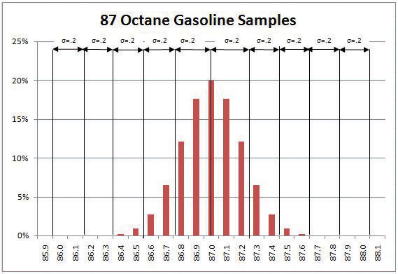
Compare the chart in the spreadsheet to the chart in Figure 10.13 "Normal Distribution of Gasoline Samples" that was used in the text. Observe that the standard deviation, σ, is .2 and that almost all the sample values occur between 86.4 and 87.6—three σ on either side of the mean.
Figure 10.13 Normal Distribution of Gasoline Samples
© Microsoft Corporation. All Rights Reserved. Used with permission from Microsoft Corporation.
- Open a word processing document and then save it as Ch10STDStudentName.doc. Switch back to the spreadsheet and capture the screen. Switch to the word processing document and paste the screen into the document.
-
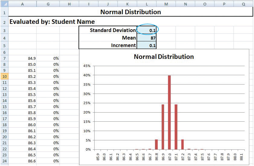
Switch back to the spreadsheet. To see the effect of a better production process that would have a σ of .1 instead of .2, click cell L3. Type .1 and then, on the Formula bar, click the Enter button. The distribution narrows so that almost all the estimated samples are within .3 on either side of the mean (87.0), as shown in Figure 10.14 "Normal Distribution with Smaller Standard Deviation".
Figure 10.14 Normal Distribution with Smaller Standard Deviation
© Microsoft Corporation. All Rights Reserved. Used with permission from Microsoft Corporation.
- Capture the screen showing in the narrow distribution and paste it into the word processing document.
-
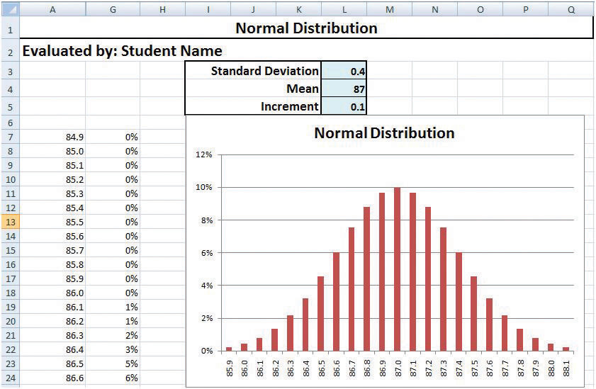
In the spreadsheet, in cell L3, type .4 and then, on the Formula bar, click the Enter button. Notice that a larger standard deviation means the distribution is more spread out. Three standard deviations is 1.2 (3 × .4), so almost all the samples will be within 1.2 on either side of the mean, as shown in Figure 10.15 "Normal Distribution with Larger Standard Deviation".
Figure 10.15 Normal Distribution with Larger Standard Deviation
© Microsoft Corporation. All Rights Reserved. Used with permission from Microsoft Corporation.
- Capture this screen and paste it into the word processing document.
- Change the value in cell L3 to 1. Almost all the samples will be above 84 (87−3) and below 90 (87+3), but the horizontal scale is too small to show all the values.
- Change the value in cell L5 to .3.
- Capture the screen and paste it into the word processing document.
Use the Spreadsheet for a Different Example
The effects of a lower-than-expected octane rating in a passenger car might be engine knock during acceleration and less power climbing a hill, but the effect of lower-than-expected octane fuel in a military aircraft might mean that the plane could not achieve the desired altitude or speed in a critical situation. Aviation gasoline is designed for use in high-performance engines that require 100 octane fuel. Use the spreadsheet to examine the estimated distribution of gasoline samples with a different mean and σ.
Examine a Normal Distribution
Complete the exercise by following these instructions:
- Change the value in cell L4 to 100 and the standard deviation in cell L3 to .1. Notice that a standard deviation of .1 means that 99.7 percent of the gasoline samples will be between 99.7 and 100.3 octane.
- Practice changing the mean and standard deviation values in the spreadsheet. Each time you do so, predict the high and low values that represent three σ above and below the mean and use the spreadsheet to check your prediction. If the values extend beyond the sides of the chart, increase the increment value in cell L5.
- Capture the screen that shows one of your estimates that is different from the examples shown in the previous steps and paste it into the word processing document.
- In the word processing document, below the last screen, write between one hundred and two hundred words to describe what you learned about the relationship between the standard deviation and the distribution of likely values. Specifically describe how you predict the upper and lower limits of the range.
- Close the spreadsheet. Do not save the changes.
- Save the word processing document as Ch10STDStudentName.doc.
-
Review your work and use the following rubric to determine its adequacy:
Element Best Adequate Poor File name Ch10STDStudentName.doc Same or .docx file format Student name missing Predict likely range of values in a normal distribution Five screen captures plus a reflective essay on what you learned about predicting the upper and lower limits defined by 3 σ Same as Best Missing pictures; essay does not describe how the upper and lower limits of 3 σ are calculated - Revise the document, if necessary. Save the document and submit it as directed by the instructor.
Recognizing Variations Due to Unassignable and Assignable Causes
W. Edwards Deming teaches that some variation is inevitable due to chance cause. A manager needs to recognize the difference between variations that are due to chance and those that indicate the presence of an assignable cause or a trend. If it appears that there is an assignable cause for variation in quality, a project manager might be required to identify and fix the problem. To communicate with process managers who are monitoring and sampling production, it is useful to understand the use of control charts.
A run chart is a type of chart that shows variations from the mean as a function of time. The value of each sample is plotted to show the day it was taken and how it differs from the mean. If the variation is random, there will be roughly the same number of points above and below the mean.
A spreadsheet can be used to simulate random variations in production. In this exercise, the spreadsheet uses its random number function to pick two numbers that are positive and two that are negative and adds them to the mean. Each number represents a variation that is between the control limits. Most of the time the positive and negative numbers cancel each other out and result in a sum that is close to the mean, but occasionally the four random factors add up to values that are far from the mean.
In this part of the exercise, you observe variations in a run chart and frequency distribution chart that are due to random effects. You generate the random numbers several times to see what production runs with random (unassignable) variations look like.
Examine a Run Chart with Random Effects
Complete the exercise by following these instructions:
- Navigate to the directory location where the exercise files for this unit are located and open Ch10ControlChart.xls in a spreadsheet program such as MS Excel.
- Observe that in cells B4 through B23 the RAND function is used to simulate the effects of four random influences on each day of production for a twenty-day period.
-
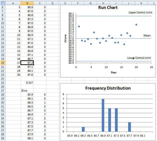
Scroll the screen or adjust the zoom so that you can see both charts. See Figure 10.16 "Screen Adjusted to Show Both Charts".
Figure 10.16 Screen Adjusted to Show Both Charts
© Microsoft Corporation. All Rights Reserved. Used with permission from Microsoft Corporation.
- On your keyboard, near the top, press the F9 key. The random functions pick new numbers. Observe how the samples on the run chart change and how the frequency distribution changes.
-
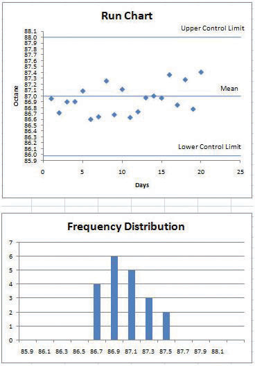
Press the F9 key several more times until you get a set of samples that are grouped close to the mean like the example shown in Figure 10.17 "Most Samples near the Mean".
Figure 10.17 Most Samples near the Mean
© Microsoft Corporation. All Rights Reserved. Used with permission from Microsoft Corporation.
- Open a word processing document and then save it as Ch10RunChartStudentName.doc. Switch back to the spreadsheet and capture the screen. Switch to the word processing document and paste the screen into the document. Your values will differ from those in the figure.
- According to Deming, it is not productive to hold employees to quality standards that they do not control. Consider the effect on employee moral if this set of samples was taken as the standard by which the next run would be judged.
-
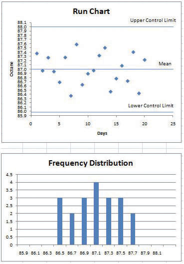
Press the F9 key again and stop at a set of samples that has a greater variation, such as the example shown in Figure 10.15 "Normal Distribution with Larger Standard Deviation".
Figure 10.18 Greater Variation
© Microsoft Corporation. All Rights Reserved. Used with permission from Microsoft Corporation.
- Capture this screen and paste it into Ch10RunChartStudentName.doc. Because of the chance-cause random factors, this set of data has more variation. If employee performance were punished or rewarded based on this data, they would become discouraged because they do not control the quality. Leave both files open.
Examine a Run Chart with Assignable Cause
Complete the exercise by following these instructions:
An assignable cause can be mixed in with the chance-cause random effects. In this part, you introduce a factor that causes the samples to display a trend. You run the simulation several times to learn how to recognize a set of data that is a mix of random (chance-cause) factors and a trend that is probably from an assignable cause.
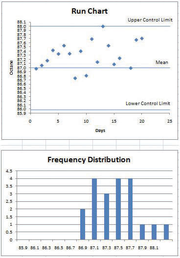
- In the spreadsheet, click cell B2. Type .03 and then, on the Formula bar, click the Enter button. The random functions are recalculated, but each value is increased by .03 over its predecessor.
-
Press the F9 key several times and observe how this trend appears within the samples such as the example in Figure 10.19 "Trend That Is Probably Due to an Assignable Cause".
Figure 10.19 Trend That Is Probably Due to an Assignable Cause
© Microsoft Corporation. All Rights Reserved. Used with permission from Microsoft Corporation.
- It is clear that action must be taken soon to prevent the next batch of samples from exceeding the control limit. The process manager might create a project to identify the assignable cause and take the necessary action, such as replacing a worn-out piece of equipment. Choose an example where the upward trend is most apparent. Capture the screen and paste it into the word processing document.
- Close the spreadsheet without saving the changes.
- In the word processing document, below the last picture, write a reflective essay of between one hundred and two hundred words that describes how you would recognize the difference between run charts that show assignable and unassignable causes. Discuss the effect on morale if one of the runs with random values that are close to the mean is chosen as the standard of performance by which workers would be measured.
- Leave the word processing document open.
-
Review your work and use the following rubric to determine its adequacy:
Element Best Adequate Poor File name Ch10RunChartStudentName.doc Ch10RunChartStudentName.docx Did not include name in file name Recognize assignable and unassignable causes of statistical variation Three screen captures that show two random causes and one assignable cause; an essay that describes how to recognize the difference and the effect on worker morale if a run with low random variation is chosen as a standard Same as Best Missing screen; essay does not address both requirements - Save the file and submit it as directed by the instructor.


