This is “Writing the Business Case: Design a Report for the App”, chapter 11 from the book Designing Business Information Systems: Apps, Websites, and More (v. 1.0). For details on it (including licensing), click here.
For more information on the source of this book, or why it is available for free, please see the project's home page. You can browse or download additional books there. To download a .zip file containing this book to use offline, simply click here.


Chapter 11 Writing the Business Case: Design a Report for the App
11.1 Pros and Cons of PowerPoint
Learning Objectives
- Present evidence for your conclusions
- Determine when to use PowerPoint as a report writer rather than a presentation tool
- Describe the conditions under which PowerPoint fails to communicate well
Introduction
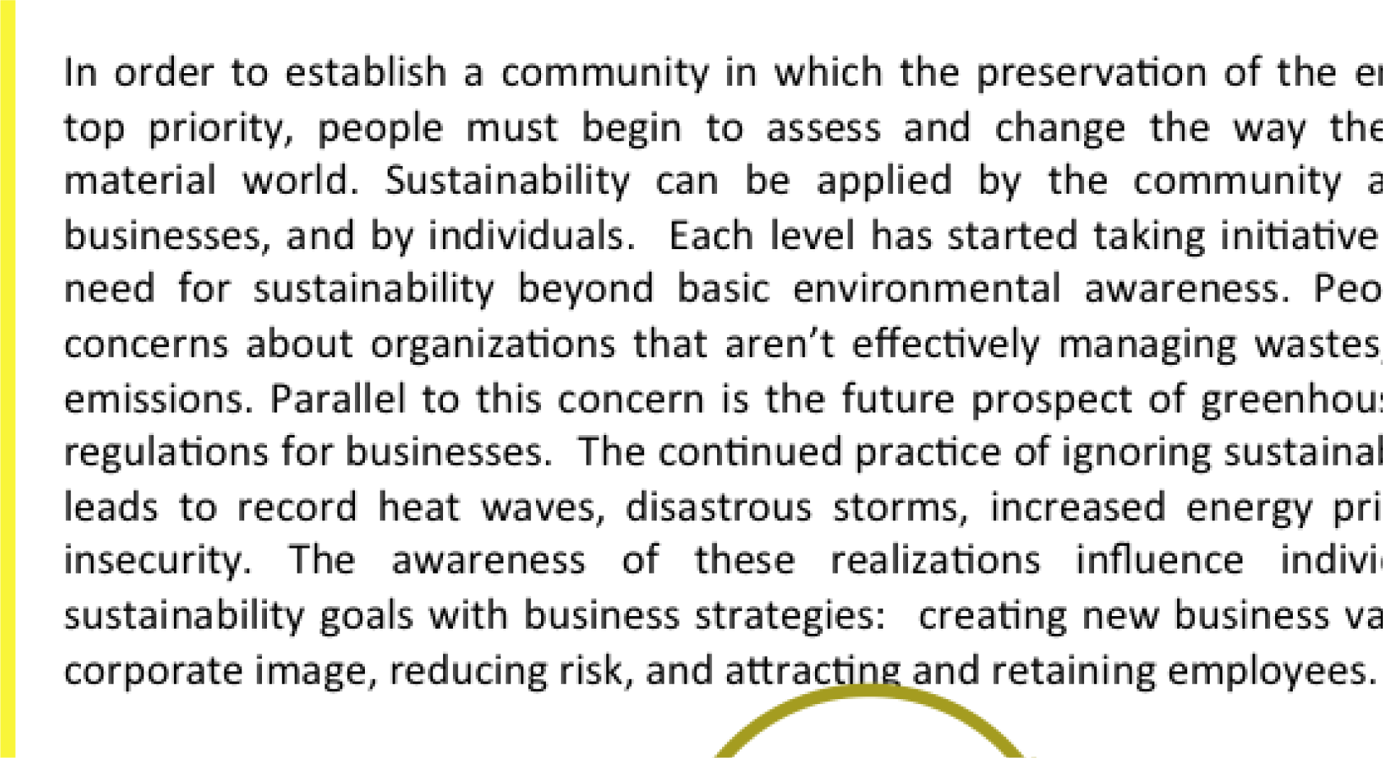
When applying for a business loan or seeking investors, you will have to present your project. You are likely to fare better if you follow accepted standards of business presentations. One of those standards is the schematic reportA business presentation combining concise text and graphics. Schematic reports should be brief, well organized, and easy to navigate. Though usually designed in PowerPoint, schematic reports are intended primarily to be read rather than projected. The term was coined by Robert Heckman of Syracuse University..
You are probably already familiar with the use of PowerPoint to create presentations for an audience. Such presentations will be covered in more detail in the next chapter. However, in this chapter we look at PowerPoint as a report generation tool.
In business, PowerPoint has been gaining traction as a page layout tool to generate reports. These reports use smaller fonts, mix text and graphics, and are designed primarily to be read rather than projected on the screen. Businesses use different names for this type of report including decks, reading decks, and schematic reports.
Used in this way, PowerPoint becomes equivalent to a poor man’s desktop publishing package—but with the added advantage that the report also fits neatly on the screen.
However, it is difficult for an audience to read a font smaller than 24 point onscreen. Small font presentations (around 11 point) raise the obvious question as to why the presentation should be projected at all.
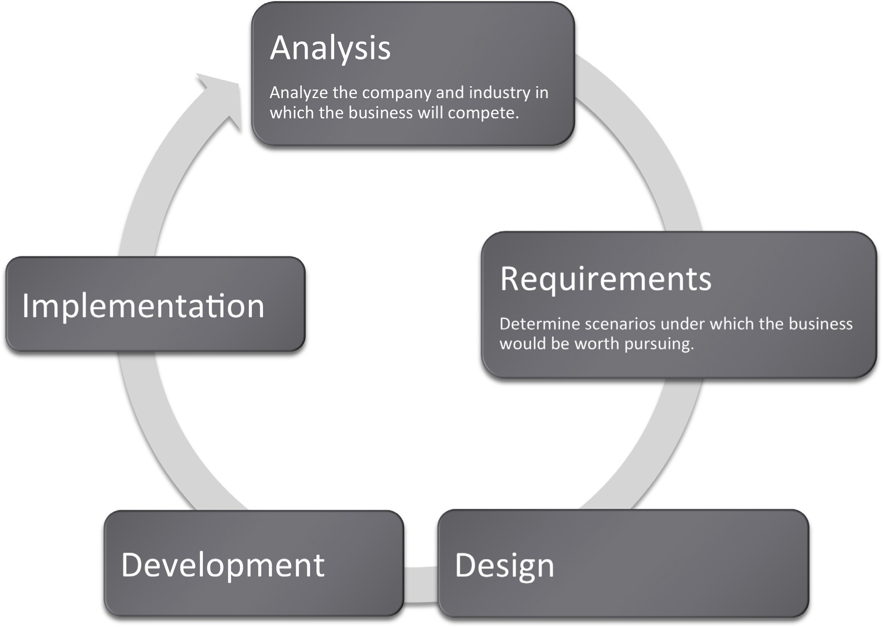
Where Are We in the Life Cycle?
Many information systems projects are conceived of in a life cycle that progresses in stages from analysis to implementation. The diagram below shows the stages that we touch in the current chapter:
Focus on Evidence
Rarely can you prove anything in business. The best you can do is give evidence for your position. Your audience will decide whether your evidence is compelling. And if it is not compelling, well then you have learned something for next time.
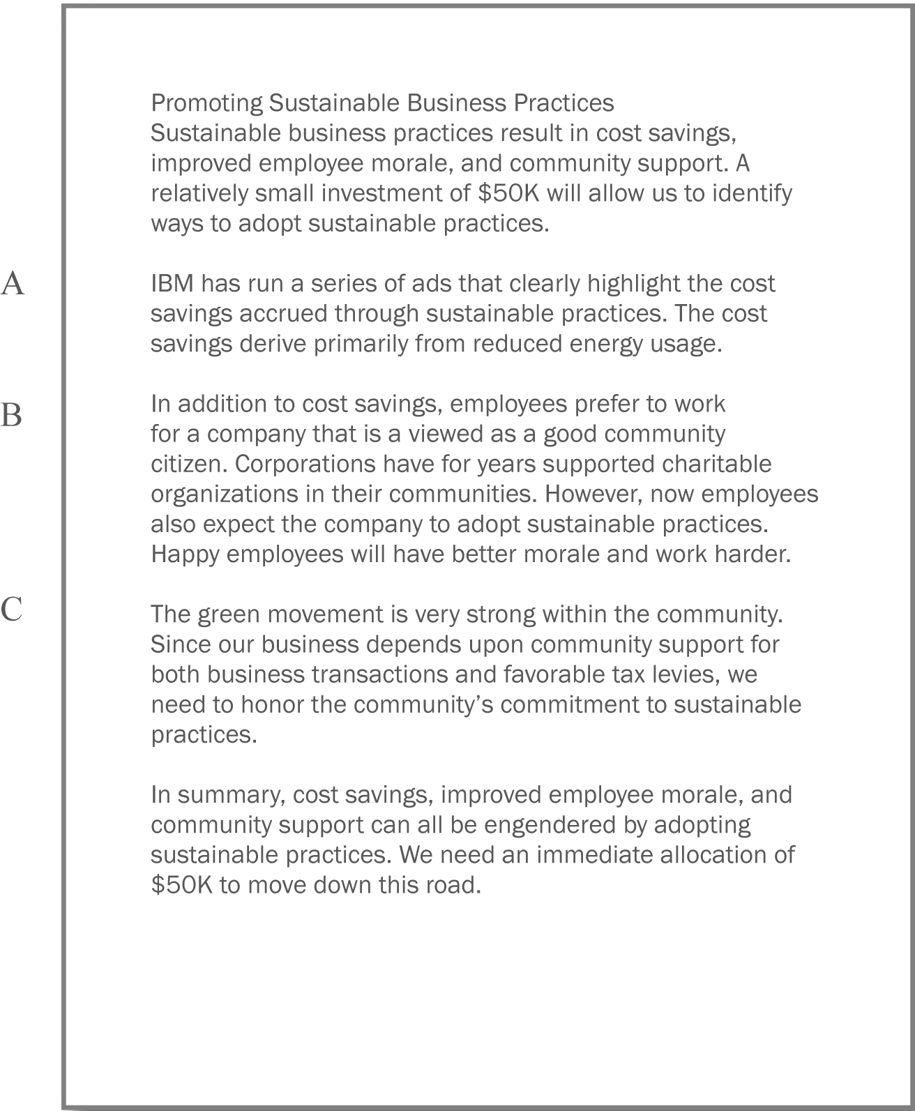
In most business presentations, you will need to get across information that inspires your audience to take action. Design is not a substitute for good content, but the combination of the two produces excellent results. The table below demonstrates a method of critical thinking. The method shows how to organize an argument in order to support a claim. Note that every point is supported by hard evidence. This format can be used both in papers and presentations:
Table 11.1
|
Paragraph |
Thought Process |
Sample Words |
|---|---|---|
|
Claim or thesis |
Here’s what I believe based on points A, B, and C. |
I believe we should allocate$50K to investigate sustainable business practices because of cost savings, employee morale, and community support. |
|
Evidence of A: examples and credible sources |
Here’s why I believe A. |
Cost savings through reduced energy usage. |
|
Evidence for B: examples and credible sources |
Here’s why I believe B. |
Improved employee morale by working for socially responsible company. |
|
Evidence for C: examples and credible sources |
Here’s why I believe C. |
Community support for green practices. |
|
Summary |
As I have shown, my belief _____ is reinforced by points A, B, and C. |
In summary, cost savings, employee morale, and community support, encourages allocation of $50K to investigate sustainable business practices. |
PowerPoint as a Report Writer
Traditionally students are taught to write reports using a word processor such as Microsoft Word. The emphasis in the reports is on grammar and composition. However, much of corporate America has been moving in a different direction. The primary means of formal communication in corporations is with PowerPoint.
PowerPoint was developed as a presentation graphics package. PowerPoint presentations are designed to supplement a live presenter. For this reason, the fonts used tend to be large (around 24 point) and the words few (less than fifty per page) so that the audience can read them. The bullet points also serve as a cue for the presenter in lieu of note cards.
To put this in perspective, a single page of a word processed document could have 500 words or ten times as many words as a slide. The words would be set using a smaller font—usually 10 or 11 point.
With relatively few words to express oneself, every word should be carefully chosen. Unfortunately, very often we see the opposite—presentations hastily assembled at the last minute.
However, there is a growing movement to create presentations that can stand with or without the presenter. This requires using smaller fonts and adding far more text. The small text creates a presentation that can no longer be read easily by the audience. What should be a presentation turns into an eye test. To compensate, many times audience members are each provided with a copy of the presentation. So while they may not be able to read the screen, they can follow along.
Hopefully the copy provided to the audience contains one slide per page. Unfortunately, sometimes in an effort to save paper, the presenter will use a PowerPoint handout with three slides per page and a space for the audience to write notes. This simply transfers the eye test to paper.
The term used in corporate America to describe a PowerPoint presentation is a deck. The term has obvious ties to a deck of cards. And like a deck of cards, one can easily reorganize a deck to customize the presentation for a new audience. The term deck is used whether the slides are primarily designed for a presentation or primarily designed to be read. However, to be clear about which we mean, we will use the term schematic report to describe a deck intended to be read rather than projected.
Distributing handouts to the audience is only helpful if the slides are readable. Here they are not, nor would they be readable projected on the screen. The only way to make this presentation readable is to print one slide per page.
How to Overcome the Cons
PowerPoint has four advantages over Word. First, it does help keep everyone on the same “page.” A PowerPoint “page” fits conveniently on one screen—a Word page would not. Second, PowerPoint allows for easy integration of text and graphics. Text boxes and images stay put and resize intuitively without creating awkward page breaks. You can similarly integrate text and images in Word—but it is less intuitive. Third, PowerPoint themes allow the presentation to take on a slick and unified look, almost like a brochure. Each theme has a number of layouts associated with it so that each slide can be structured to accommodate the material for that slide while still having the same look as the rest of the presentation. Fourth, because each slide tends to encapsulate a complete idea, it is fairly easy to reorganize the deck to customize it for a new audience. There is even a slide sorter view to help with this task.
PowerPoint also has some disadvantages as a report writer, as compared with Word. First, without text flow the presenter is tempted to fit each idea, no matter how complex, onto a single slide. Lack of text flow can lead to over abbreviation of complex concepts—sometimes with disastrous results. Second, PowerPoint resizes text automatically to fit on the slide. As you add words to a slide, the font shrinks in size so that all the text will fit. If the subsequent slide has fewer words, the text will be larger; if it has more words, the text will be smaller. Auto text resize leads to awkward differences in text size among slides—which does not look professional.
To expand on the text resize point a little bit more, consider that memos and other office documents are normally set in around 11 point type. PowerPoint slides usually opt for at least 24 point type. The no man’s land between 11 point and 24 point might be around 16 to 18 point. This looks like the font of a children’s book, which is not professional. The example below shows the body text at both 12 point and 18 point.
Both PowerPoint disadvantages—auto text resize, and one idea per slide—can be overcome. Some PowerPoint templates, such as PitchbookA PowerPoint template well suited for creating schematic reports because of its small font size and versatile layouts., suppress text resize. With the font locked at 11 point, the writer can avoid a no man’s land 16 or 18 point font. Overcoming the text flow problem is harder. Our recommendation is that the writer create all content in Microsoft Word and then flow the content into PowerPoint. In fact that is how we created the slides below.
11 point (above) is good for a written report. 16 point (following) looks like the font in a children’s book.
Does PowerPoint Corrupt Us?
There is a third, more controversial, disadvantage of PowerPoint. Edward Tufte argues that PowerPoint encourages the pitching of ideas rather than dispassionate reflection. He cautions that when we pitch out, we corrupt within. In other words, if we tend to use a medium designed to sell ideas, rather than discuss them, we might lose our own objectivity to the detriment of our message—and our organization. Certainly there is some evidence for Tufte’s position. A quick look at the built in PowerPoint templates, reveals a decidedly marketing orientation. For example, there is a built in Pitchbook template, but there does not appear to be a built in “weigh all angles” template.
Tufte terms the tendency to market and simplify ideas the cognitive style of PowerPoint. He is especially troubled by the use of bullets rather than complete sentences and paragraphs to convey information. Such presentations he argues should not circulate alone as though they are documents. He provides a compelling example of the dangers of PowerPoint reports with the Columbia Space Shuttle disaster. On February 1, 2003, the Columbia Space Shuttle disintegrated and burned up on reentry, when its heat shield was compromised by a foam hit 16 days earlier. The official presidential report faulted the way that the potential danger had been poorly communicated by Boeing using bulleted lists rather than paragraphs and complete sentences.
Tufte goes on further to claim that for on screen presentations, PowerPoint should only be used as a slide projector to project images. Words should be supplied by the speaker. There is some truth to the slide projector position as we shall see in the next section.
Having said that, however, perhaps Tufte’s remarks should be taken as a caution, rather than a condemnation of the PowerPoint medium. Having fewer words makes it more challenging to communicate, but does not preclude effective communication.
Columbia Disaster
On February 1, 2003, the Space Shuttle Columbia disintegrated upon re-entry to the earth’s atmosphere. All seven astronauts on board perished. The cause of the accident was a piece of hard foam insulation the size of a small briefcase and about the same weight as a basketball, which broke off the external fuel tank, slamming into the wing at 500 miles per hour during liftoff sixteen days earlier. The impact would be the equivalent of a 100 pound weight dropped from 200 feet in the air.
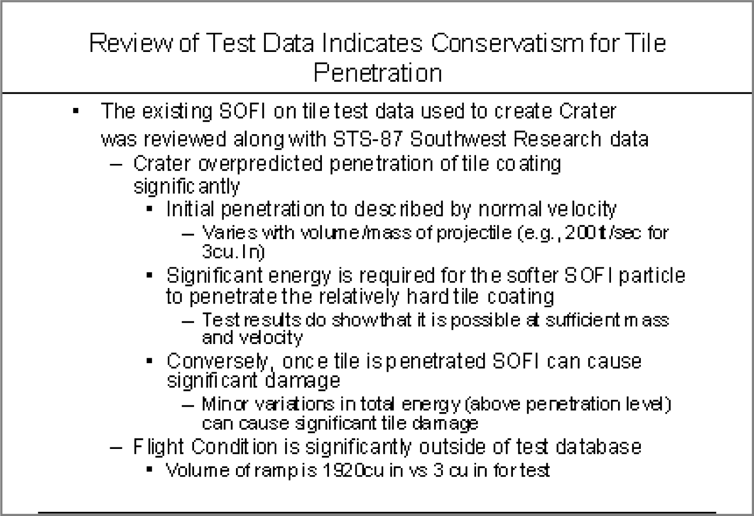
NASA knew about the foam hit the day after liftoff. They asked the fuel tank manufacturer, Boeing, to analyze the foam hit. Boeing developed a computer program called Crater to analyze the effects of foam hits. The program was calibrated using the history of foam hits on previous flights. To be safe, Crater was programmed to over predict damage. As it happens, foam hits on prior launches were a regular occurrence. However, most of the foam pieces were tiny and put only minor chinks in the ceramic heat shield tiles. However, this piece of foam was much bigger. Nonetheless, NASA’s reading of the report back from Boeing was that there was no danger to Columbia. They took no further action.
Unfortunately, the report back from Boeing took the form of a poorly designed PowerPoint deck. Edward Tufte presents a compelling case that one of the contributing factors in the Columbia Space Shuttle accident was this deck. The key slide from that deck appears on the following page. Tufte argues that PowerPoint encourages the type of sloppy writing that appears on the key slide. As you read the “Before” slide, it will appear that there is very little danger to Columbia. The title of the slide, “Review of Test Date Indicates Conservatism for Tile Penetration,” gives a false sense of reassurance. In fact, they are talking about the Crater program being conservative, not the projected damage to Columbia. Tufte feels that an author writing in complete sentences and paragraphs in a report would be less likely to be misunderstood. Maybe.
However, we would argue that the real culprit is bad writing. Bad writing is bad writing whatever the medium of expression. To us, it appears that the authors of the slide were trying to sell the virtues of the Crater program rather than acknowledge its limitations. Selling has a place at the beginning of a presentation to engage the audience interest. However, selling should never be mixed with content.
To make our point, we rewrote the key slide to remove the selling, express clearly what it really provides evidence for, and what it should have concluded. We believe that our rewrite would not have been similarly misunderstood.Tufte, Edward, The Cognitive Style of PowerPoint, Graphics Press, May 2003.
The original Boeing slide (above) and the authors’ rewrite to clarify the material below. Lead off with your conclusion and then give evidence.

Key Takeaways
- Reports should use a font size around 11 point.
- Disadvantages of PowerPoint include oversimplification of ideas, inconsistent font sizes, and a tendency to pitch rather than discuss ideas.
Questions and Exercises
- Does the abbreviated style of PowerPoint require even better writing? Explain.
11.2 Schematic Report
Learning Objectives
- Create a schematic report used in business communications
- Make a business case to have investors or a bank provide development funds for your iPhone app
- Integrate deliverables produced earlier in the course to help make the business case
Report vs. Presentation
A schematic report minimally contains the following elements.
- Title page with author.
- Executive summary: A summary analysis of the report with the key facts, issues, and conclusions. An executive should be able to get the gist of your entire report just by reading the executive summary.
- Table of contents—with page numbers identifying section and second level headings only.
- Introduction.
- Body: that includes the analysis and recommendations (most of your report). To provide continuity the evidence should point back to the main argument.
- Conclusion.
The report may also include a letter of transmittal, references, and appendices.
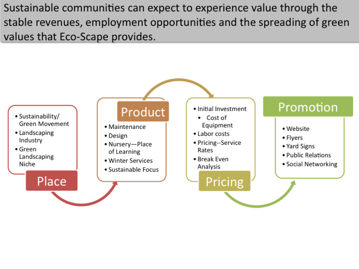
If a schematic report contains too much detail to be projected, what can you use for your presentation? The solution is to create two decks—a schematic report intended to be read and an accompanying presentationA presentation primarily designed to be projected which combines brief text and graphics. Presentations use few words and large fonts for audience readability. intended to be projected. The task is not as hard as it might seem. Schematic reports tend to be heavy on graphics. All of those graphics can be copied from the schematic report to the presentation report. Within the presentation, those graphics should be enlarged, perhaps to fill the entire screen. Key summary points can similarly be lifted from the schematic report while leaving the bulk of the text behind. The speaker will provide the gist of the text during the presentation. The two decks can even run in the same order so that the audience can follow along in the written report.
Hopefully, Microsoft will one day modify PowerPoint so that it produces the presentation automatically from the schematic. Here is how it might work. The writer tags text and graphics from the schematic report that are intended for the presentation. PowerPoint automatically enlarges the tagged graphics to fill the screen. The tagged text is similarly enlarged to at least 24 point, then placed in a text box overlaying the illustration—like subtitles in a foreign movie. When the slide loads it could even begin with the slide from the schematic, which then morphs to become the presentation slide.
Until Microsoft provides the transformation utility, we will have to create the presentation from the schematic ourselves. The easiest way to do this is by beginning with the schematic and then stripping it down to the graphics and key text, then enlarging those and arranging them on the screen.
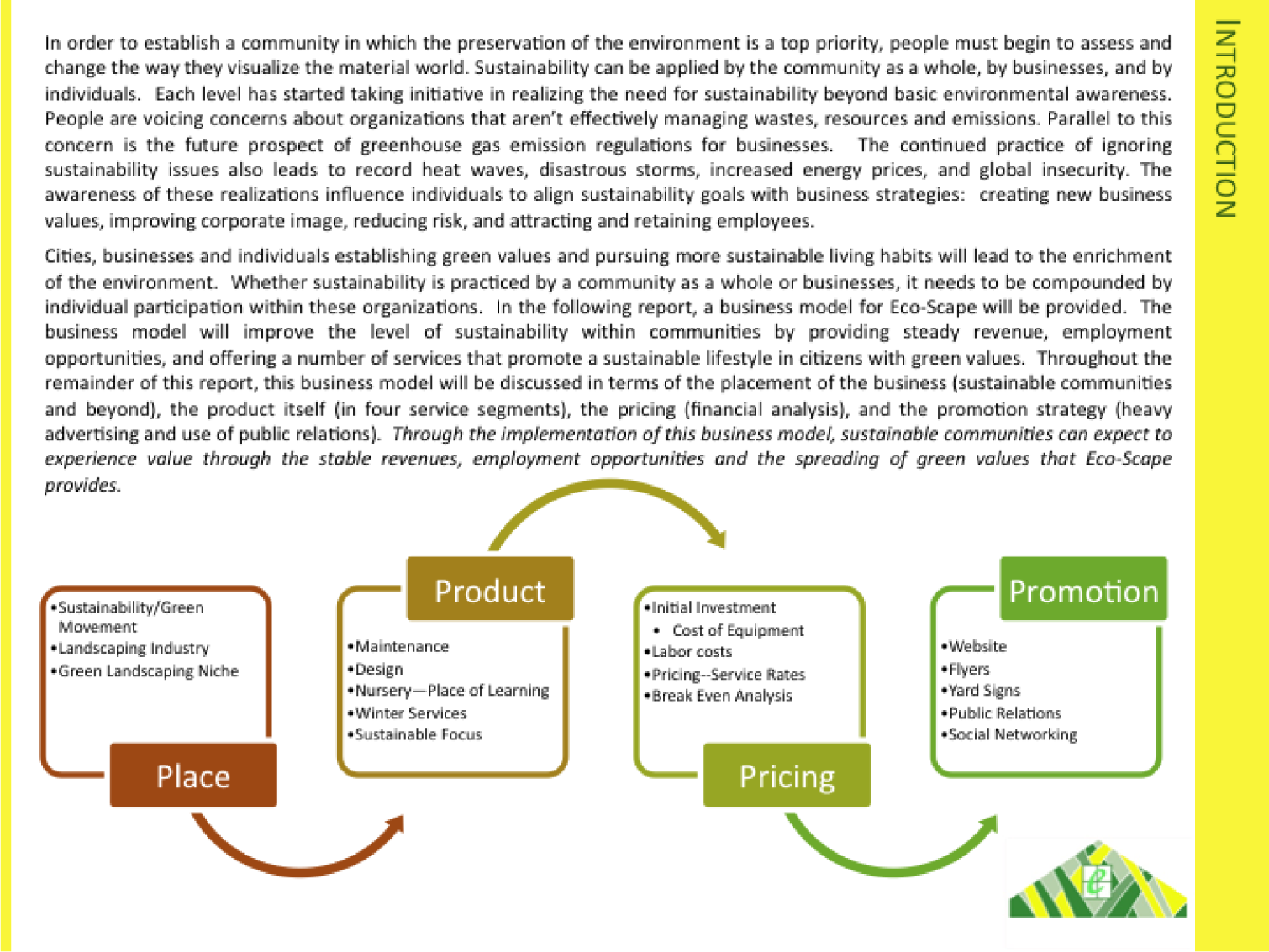
Page from schematic report (above), which matches the presentation slide (below). The key sentence from the schematic slide becomes the title of the presentation slide. The artwork is enlarged. Note that even the text in the artwork has been enlarged.
Writing an Executive Summary
Every schematic report leads off with an executive summary. An executive summary usually occupies one page and summarizes the key facts, issues, and conclusions of the report. A manager should be able to garner enough information from the executive summaryThere are many definitions of an executive summary—some are highly specific. We have chosen to go with one of the more general definitions modified from: smallbusinessdictionary.com to make a decision. The rest of the report is effectively backup if there are questions that arise from the executive summary.
Many times a senior level manager will not even read past the executive summary. Rather they will assign one or more junior level managers to follow up on a subsection of the report. Looked at this way, the executive summary is obviously something that you want to spend a lot of time crafting—not a reluctant chore at the end of the process.
The key to writing an executive summary is to get quickly to the point. We can actually tie the parts of the executive summary back to terms with which we are already familiar:
- Key facts—what is the current state? What are enablers that will help with the proposed solution?
- Issues—what are the barriers that would impede the proposed solution?
- Conclusions—what is the report specifically recommending? What course of action should the reader take?
One of the most common mistakes is to treat the executive summary as an introduction to the report. You will have an opportunity later to write a gentle introduction to the report, but not in the executive summary.
Because our reports are relatively short, you probably will reference most sections in the executive summary. However, in a larger report, there may be entire foundation or due diligence sections not covered in the executive summary. That’s OK. You still need to do the due diligence to make your case. When deciding what to include simply ask yourself, would a manager need to know this to make a decision?
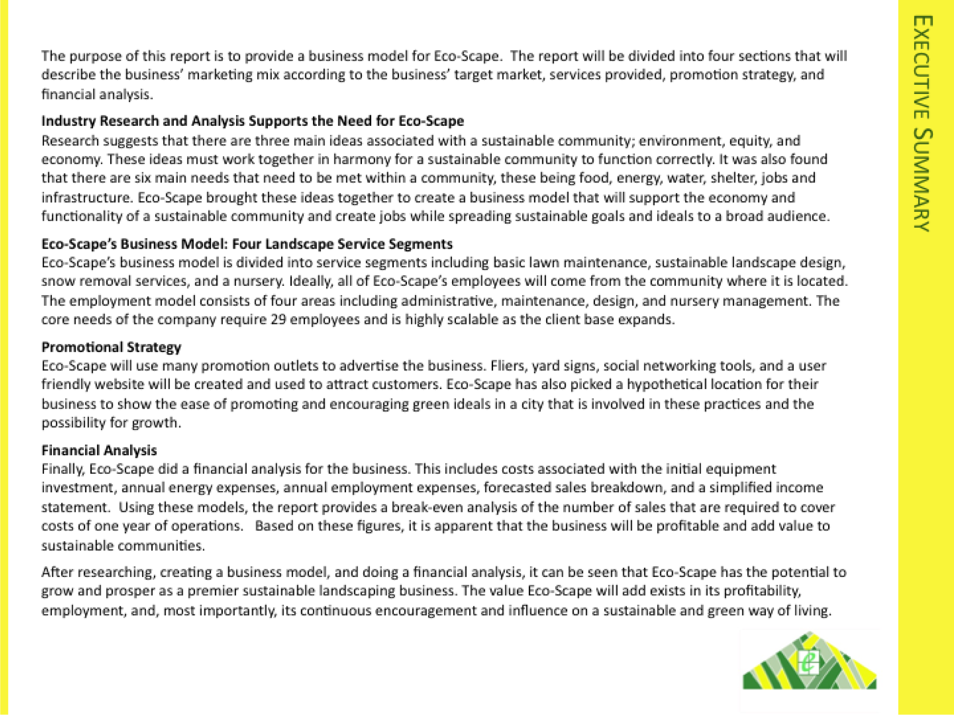
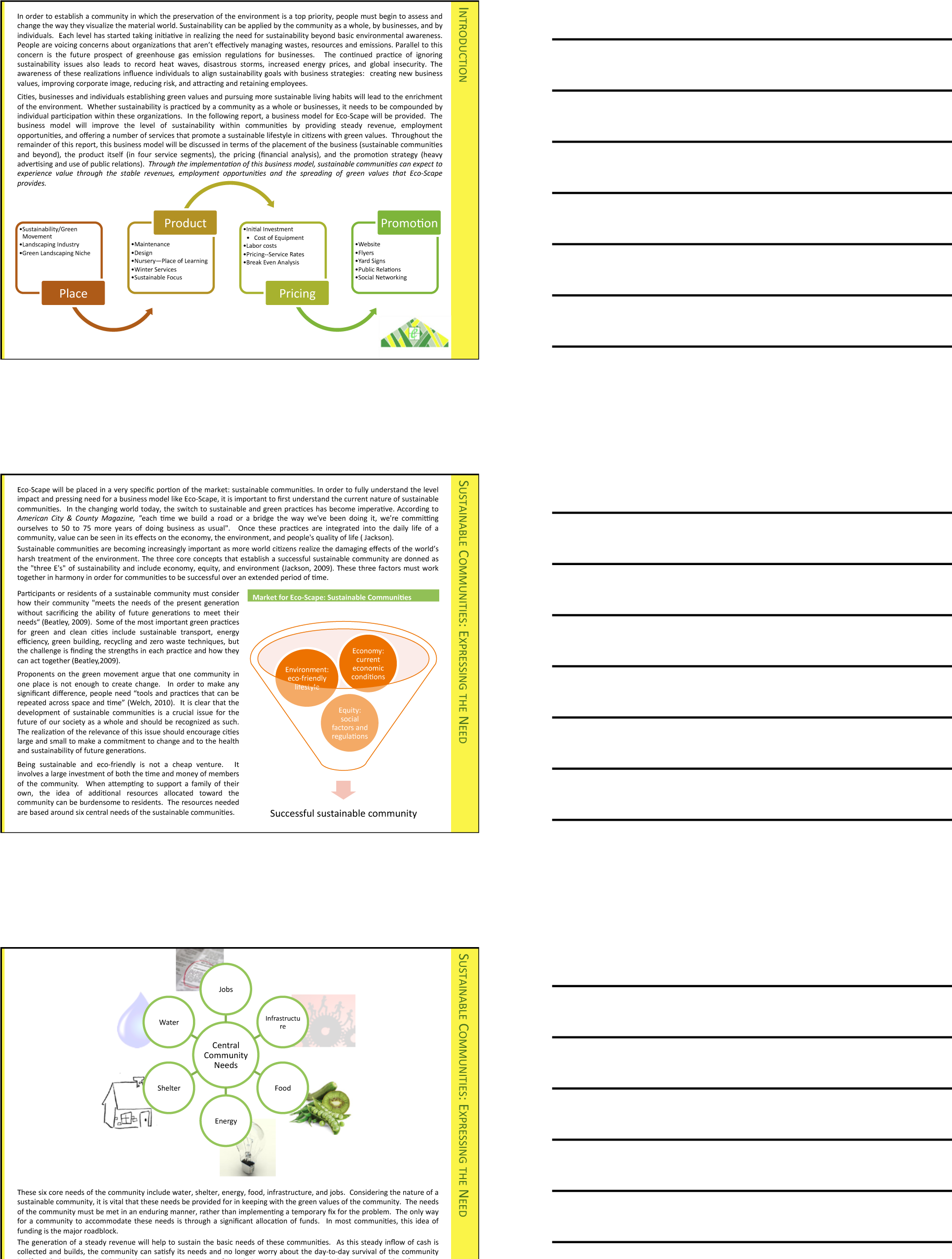
An executive summary should highlight the key facts, issues, and conclusions of the report. The example above is pretty good, but it is missing the issues—what barriers are present that would prevent the proposed solution?
Key Takeaways
- You should prepare both a written report and a PowerPoint presentation rather than projecting the written report.
- The most important part of your report may be the executive summary as that may be the only page a busy manager will read.
Questions and Exercises
- Write an executive summary of your decision process in choosing your university.
11.3 Template for the Report
Learning Objectives
- Choose an appropriate template for a schematic report
- Modify the master page to change the look and feel of the report
- Choose an appropriate layout for each page of the report
The Pitchbook Template
While you could custom design a template for your schematic report, it is far easier to begin with a template and then modify it to fit your needs. We recommend the Pitchbook template. In spite of its name, the template is fairly reserved in its appearance. We recommend Pitchbook, because of its fonts, layouts, and table of contents.
The font in Pitchbook is Calibri, a Microsoft font designed to be read well on screen and in print. The body text size is 11 point. Curiously, minor section headings within a slide are set even smaller at 10 point, though they still stand out since there are set in white text on a colored background. The only disproportionate font is found in the major section headings that run down the right hand side of the page. These are set in 22 point white text on a large colored background. Why would we want the most prominent visual element on the screen to be the section that we happen to be in? Is navigation within say a hundred page report so onerous? To put this in perspective, consider that most textbooks bury the section name inconspicuously in a discreet footer—and usually set the footer in a smaller font than the body text. However, this defect can be remedied by modifying the slide master to reduce both the font size and background size of the major section headings.
The layouts that Pitchbook provides are versatile and have a consistent look and feel. Each slide can have a layout appropriate to its content—whether that is section title, heading only, or 1 up, 2 up, 3 up, 4 up, or 5 up. No matter which layout is chosen the heading and body text styles remain the same.
The table of contents in Pitchbook is just another layout called Agenda. Note how this name gives away the intention of presenting rather than reading the Pitchbook. We mention table of contents separately because though it may seem like a minor thing, a table of contents is often missing in reports.
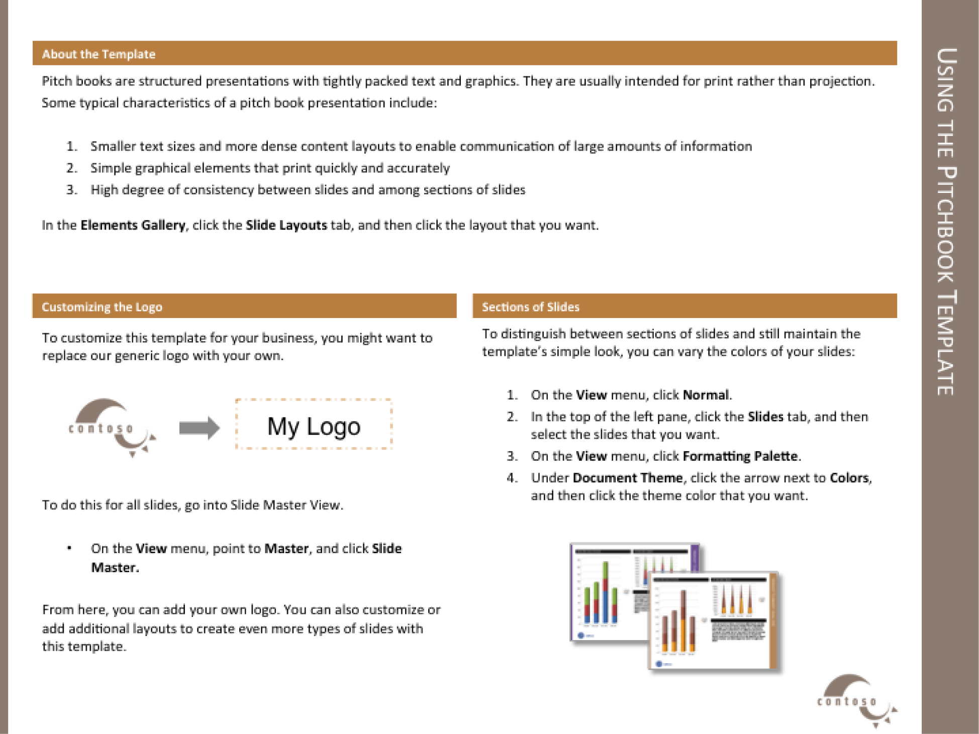
The Pitchbook template includes a slide with instructions on how to customize the template.
Templates, Themes, Layouts, Masters
Every deck is based on a theme. The themeDefines a set of background elements, colors, and fonts as well as a set of slide layouts. specifies a coherent set of colors, fonts, backgrounds, and slide layoutsThe organization of items on a page. For example, a 2up layout consists of two blocks of images and/or text.. Even the blank white background with which PowerPoint starts up is a theme called Office. Best practice is to choose a theme ahead of adding content to your presentation. That way you can ensure that the content fits well within the structure of a particular theme.
Every theme is defined by a slide masterModel slides that define the theme elements. The slide master defines the background elements, colors, and fonts. The layout masters provide a menu of possible layouts to apply to a slide.. The master is a series of model slides that define the theme and its layouts. Any change to the slide master affects every slide in the presentation. If you want to modify the theme, for example by changing the text size on the section heading, then you should do so on the slide master.
The slide master consists of a large master slide and smaller layout masters. The master slide is where most of the background elements, fonts, and colors are defined. The layout masters define the placement of items on each slide. Every slide can have a different layout and yet still look like it belongs to the presentation. For example 1 up, 2 up, 3 up, 4 up, and so forth are all different slide layouts. Furthermore, 2 up in one theme may have different spacing than 2 up in another. These differences are part of the reason that it is so critical to choose the theme in advance.
A templateA model report in which the theme is predefined. In some templates even some of the slides are already created. For example, the Pitchbook template includes a title slide, a table of contents slide, and a section heading slide. takes this process one step further. A template is a theme with content slides already preloaded. Templates help ensure that the content appears in a particular order.
For our purposes we begin with the Pitchbook template because of its theme. The theme specifies small fonts and clear section headings. That Pitchbook has slides already made is of no consequence to us and in fact we will replace those slides with our own content. What we want is the theme with its layouts.
First we will customize the Pitchbook template to correct its minor flaws.
Key Takeaways
- Templates, themes, layouts, and slide masters facilitate the graphic design of a PowerPoint deck.
- For a written report done in PowerPoint it is important to have uniform font sizes on each page.
Questions and Exercises
- Why does PowerPoint have a slide master in addition to the individual layout masters? Explain.

Slide master (top) with layout masters below it.
L3 Assignment: Create a Schematic Report
Setup
Start MS PowerPoint.
Choose a template. We recommend using the PowerPoint Pitchbook template. You may opt for a different template or even create your own but these designs should be cleared in advance.
(File > New > Presentations > Business > Pitchbook)
Content and Style
- Title page with author.
- Executive summary: A summary analysis of the report with the key facts, issues, and conclusions. An executive should be able to get the gist of your entire report just by reading the executive summary.
- Table of contents—with page numbers identifying section and second level headings only. Do this last as PowerPoint does not automatically generate or update a table of contents. Also, you would be wise to avoid the table of contents slide in Pitchbook—it is overly decorated and difficult to work with. If you add or move sections after the fact, the table of contents is a chore to update. A bulleted list on a blank slide is just fine and very easy to update.
- Introduction.
- Body: that includes the analysis and recommendations (most of your report). To provide continuity the evidence should point back to the main argument.
- Conclusion.
- Apply all graphic design principles
- Each slide should have 25 to 50% text. Obviously, there will be exceptions. Some slides may be all graphics, while other slides may be all text, e.g. the executive summary.
- Make all text left justified. Avoid centered text or text justified to both margins.
-
Customize Pitchbook as follows:
- Select View > Master > Slide Master.
- Reduce the major section headings from 22 point to 12 point. Reduce the size of the text background to match.
- Replace the logo with your own. Because the logo appears in a slightly different position on different slides, you will need to replace the logo in three places: the large Slide Master, the Title layout, and the Section Header layout.
- Change the theme colors to match colors for your app. Format > Theme Colors and modify accents #4 and #6.
- Activate the page numbers with Insert > Header & Footer > then check page numbers.
- The Pitchbook master has multiple layouts—1 up, 2 up, 3 up, and so forth. Use these as appropriate.
Deliverables
Electronic submission: Post your PowerPoint file.
Paper submission: Create a printout of each slide of your report. Print two slides per page.
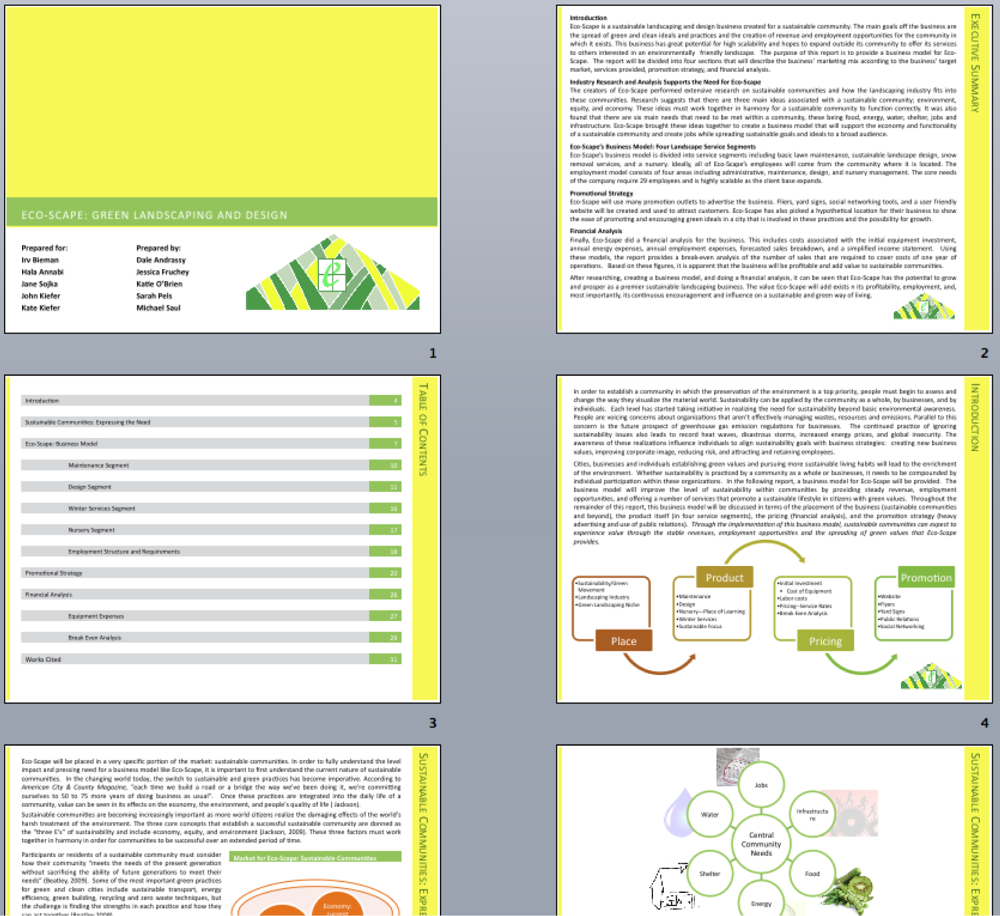
Sample pages from a schematic report. Note that the colors have been changed to match the brand.